- Aug 20
What Do CiteSpace Visualizations Mean?
- Chaomei Chen
- 2 comments
August 19-22, 2026
Words: 6,554; Figures: 39
CiteSpace visualizations use a visual language of nodes, links, clusters, colors, spatial proximity, pathways, and other patterns. Learning to read and use this visual language helps us understand not only what a visualization shows, but also what it may mean and how we can effectively communicate the resulting insights to others.
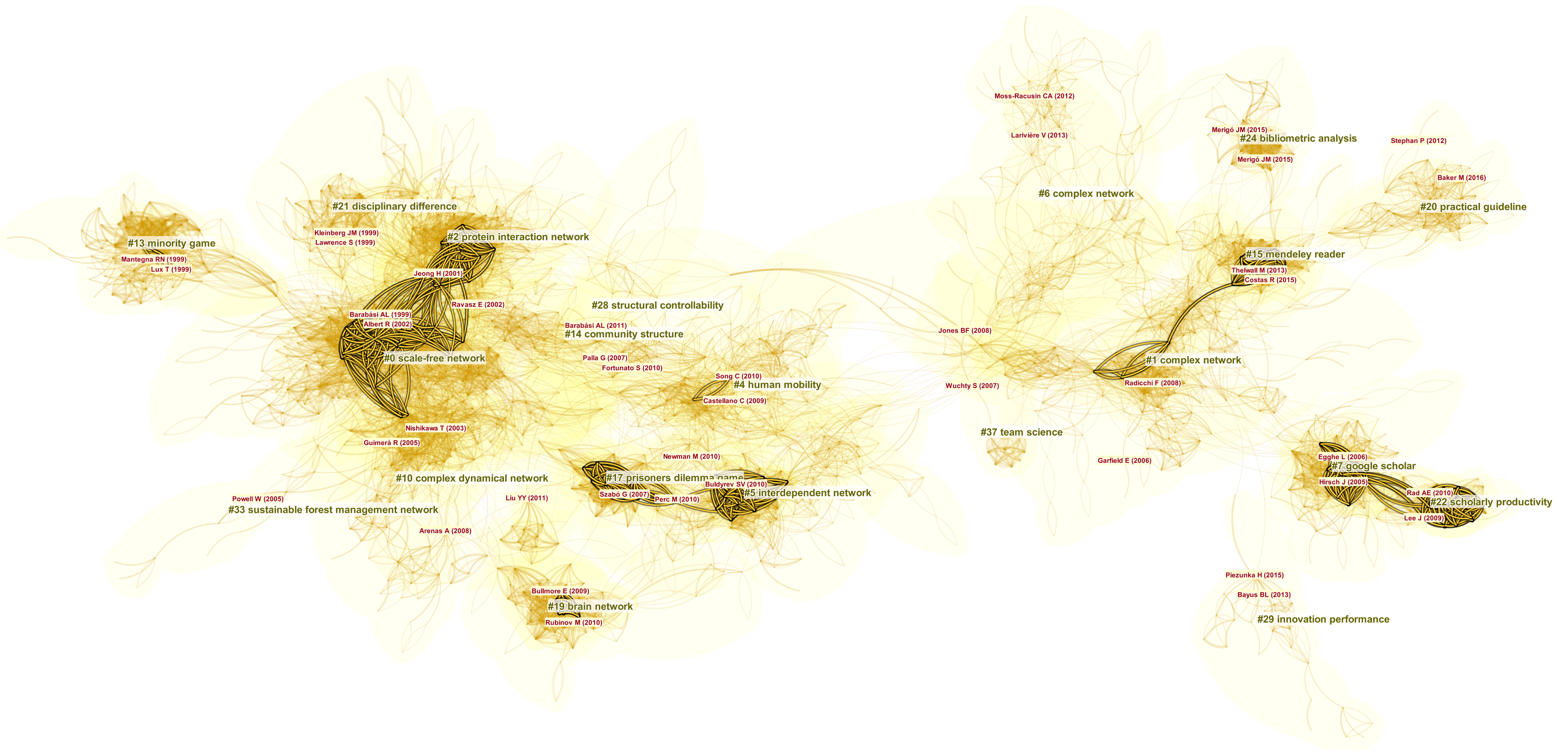
Cluster Views
Cluster View is the default visualization type in CiteSpace. It represents the underlying structural and temporal patterns of a knowledge domain. A knowledge domain can be defined in many ways—for example, by the results of a topic search, a collection of journals, or a cascading citation expansion process.
A Cluster View represents the nodes and links of a network synthesized from a time series of snapshot networks over a given period. The structure of a knowledge domain often contains thematic concentrations in which scholarly publications are tightly connected through frequent co-citations. These concentrations can be naturally represented and recognized as clusters.
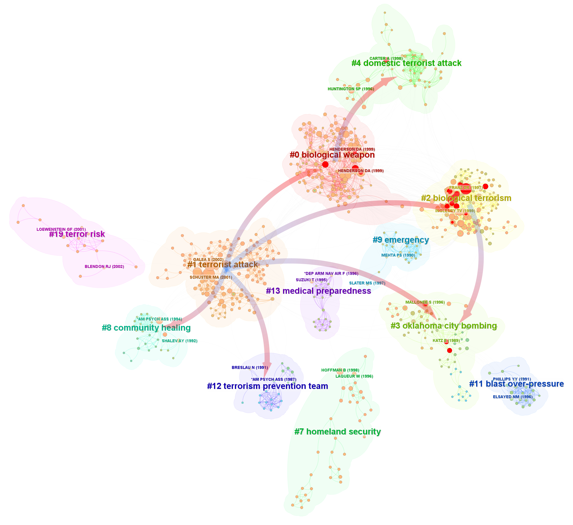
Cluster Views are particularly suitable for questions concerning the overall structure and dynamics of a knowledge domain:
What are the major components of the knowledge domain?
What is each component about?
How long has each been active?
Which areas are still growing strongly in recent years?
How are the major components related to one another?
Has the focus of the field shifted over the course of its development?
As we will see, a Cluster View isn't just showing "clusters." It simultaneously communicates: structure + thematic grouping + proximity + connectivity + prominence + time. This explains why two Cluster Views can have very different appearances while still speaking essentially the same CiteSpace "visual language."
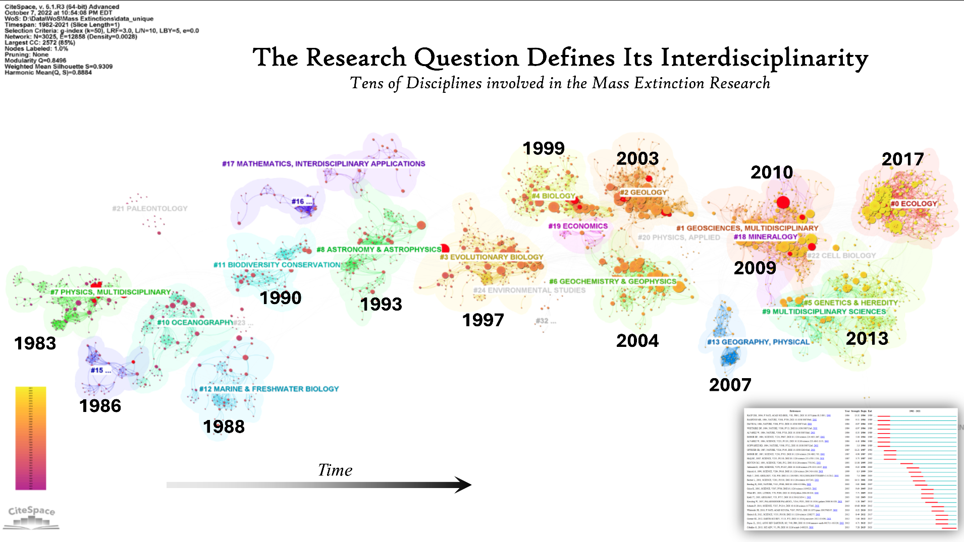
The example below depicts a network of research on mass extinction. One interesting feature is the mean age of the cited references associated with each cluster. In this case, the pattern suggests that researchers shifted their attention approximately every three to four years. This relatively rapid turnover may imply a rather short and transient window during which a publication receives sustained attention before the field moves on and directs its attention to a new set of publications. Note that such a new set may include relatively old publications that have newly gained attention, as well as more recently published ones.
The citation burst history shown in the lower-right corner reveals a continual turnover in the articles experiencing strong citation bursts. Researchers evidently shifted their attention to different articles at a rapid pace. From the perspective of authors whose publications once attracted heightened but transient attention, “publish or perish” may not fully capture the long-term nature of scholarly engagement; perhaps “keep publishing or vanish” better underscores the value of continuous contributions and sustained visibility.
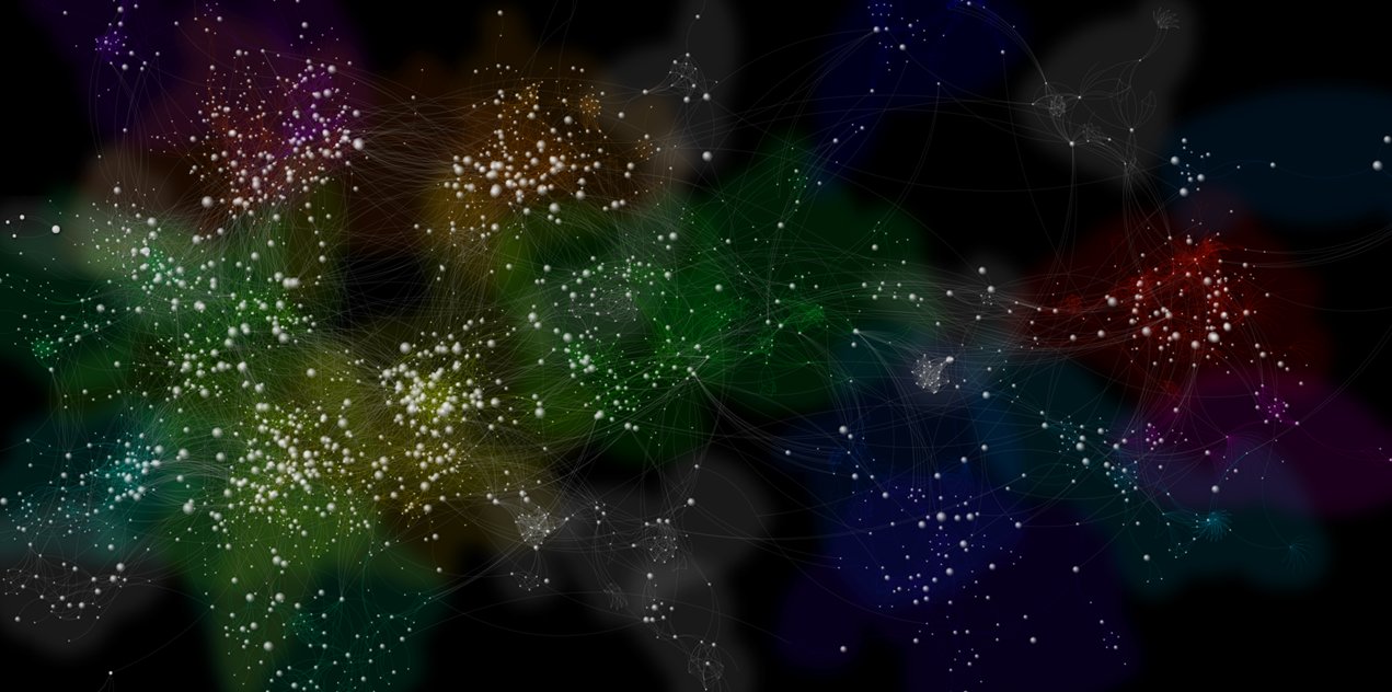
The following example is designed to evoke galaxies and constellations in the night sky, using this familiar spatial metaphor as a visual language and drawing on Gestalt principles of proximity and similarity. The intention is to leverage viewers’ intuitive understanding of spatial organization: nearby and visually similar elements tend to be perceived as related, guiding viewers in exploring the visualization and recognizing meaningful groupings and relationships.
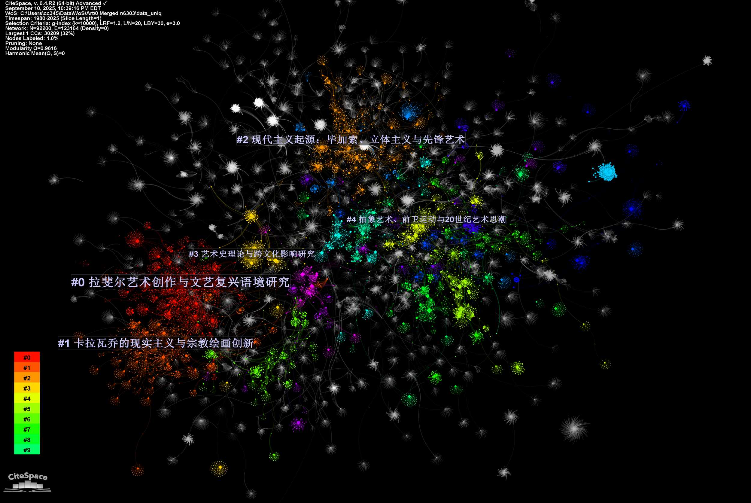
The following visualization depicts the largest connected component, containing 30,209 nodes, of a hybrid network constructed from 92,200 cited references and terms in research spanning several periods of art history, from the Renaissance and Baroque to Modernism, Postmodernism, and Post-postmodernism. The five largest clusters were summarized and labeled by a GPT model using English-language input and Chinese output, partly to demonstrate the flexibility of this approach. In brief, the three largest clusters can be characterized in English as #0 Raphael, #1 Caravaggio, and #2 Picasso. We will revisit this example later using a multi-level synthetic view.
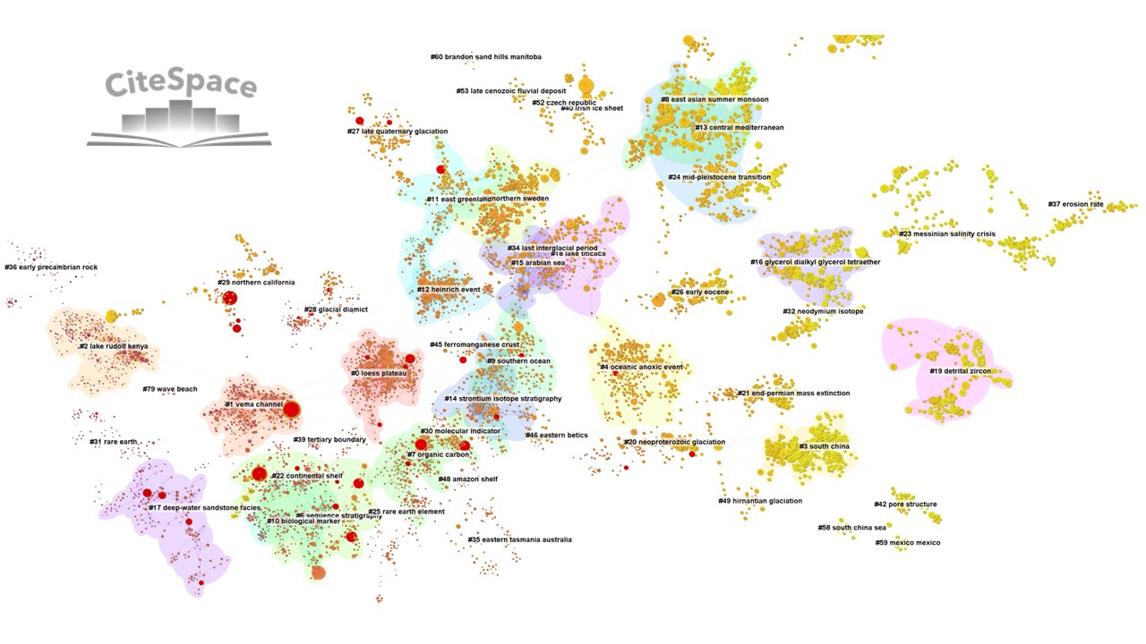
The next example demonstrates how a Cluster View can provide the broader contextual background while highlighting a set of potentially interesting hotspots. Nodes with red tree rings are particularly noteworthy because they represent publications that have attracted citations at a rapidly increasing rate, a phenomenon known as a citation burst. Showing how publications with citation bursts are distributed across a map of clusters can provide a better understanding of the pulse of the underlying knowledge domain—where attention is intensifying, which areas are becoming especially active, and how such bursts are situated within the broader intellectual structure.
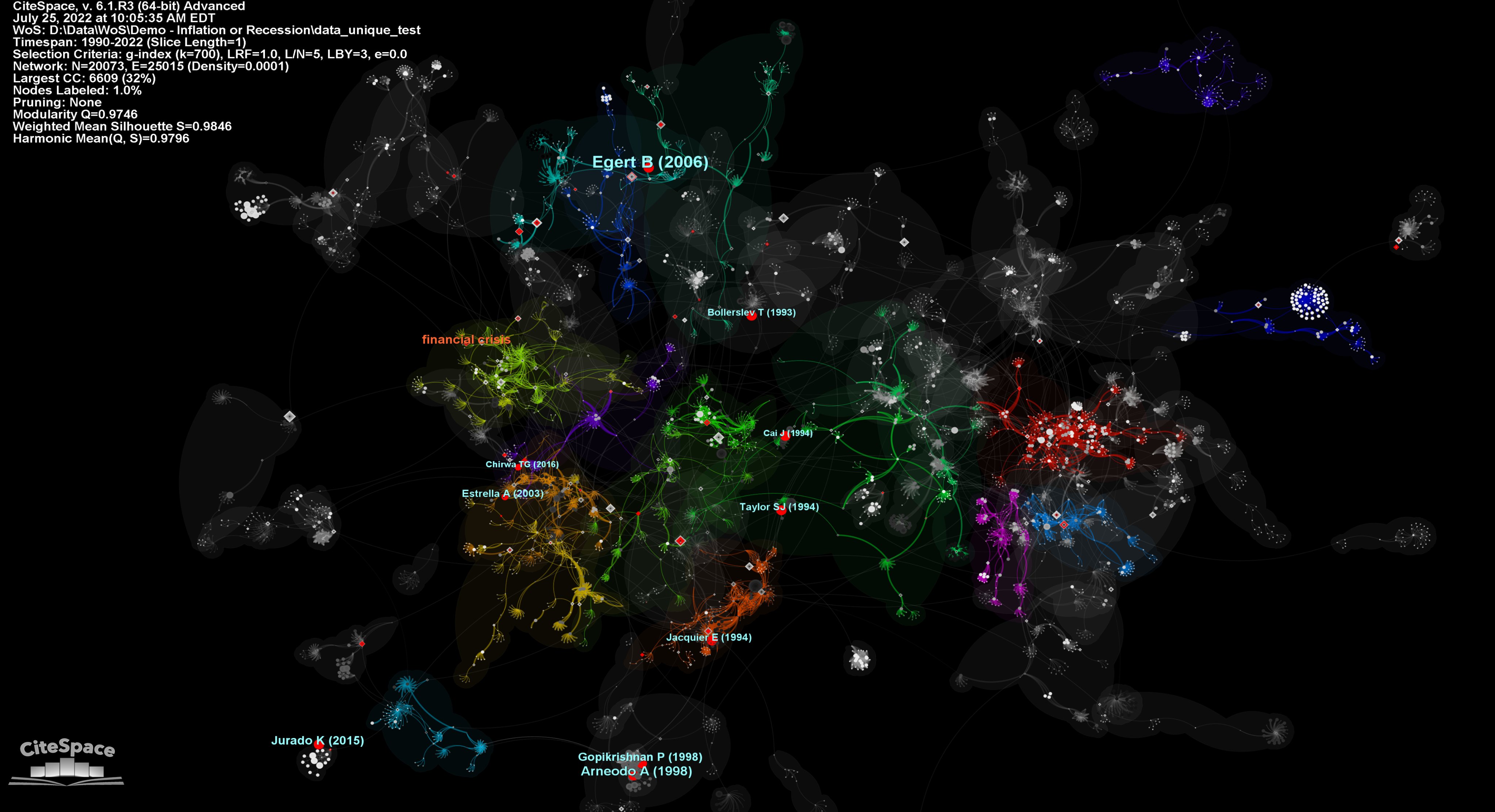
The visualization below may remind you a night sky populated by galaxies and constellations. It depicts research on inflation and recession (1980-2022). Dense concentrations of nodes form recognizable local structures, while more isolated groups appear as satellite systems connected to the larger network by relatively sparse links. This spatial organization allows viewers to perceive a knowledge domain first at the level of neighborhoods and larger formations, and then progressively examine individual publications and their relationships. Proximity, separation, density, and connectivity therefore become part of the visual language: nearby elements tend to be perceived as related, distinct concentrations suggest different areas of activity, and links between them reveal how otherwise separate regions of the knowledge domain may be connected.
An additional idea here is particularly relevant to The Visual Language of CiteSpace: this visualization supports progressive interpretation across scales. You can look at it first as a whole and see the “shape” of the field; then see clusters or constellations; then identify prominent publications; and finally inspect individual relationships. That ability to move naturally from global structure → local neighborhoods → individual nodes is a good use of this particular form of Cluster View.
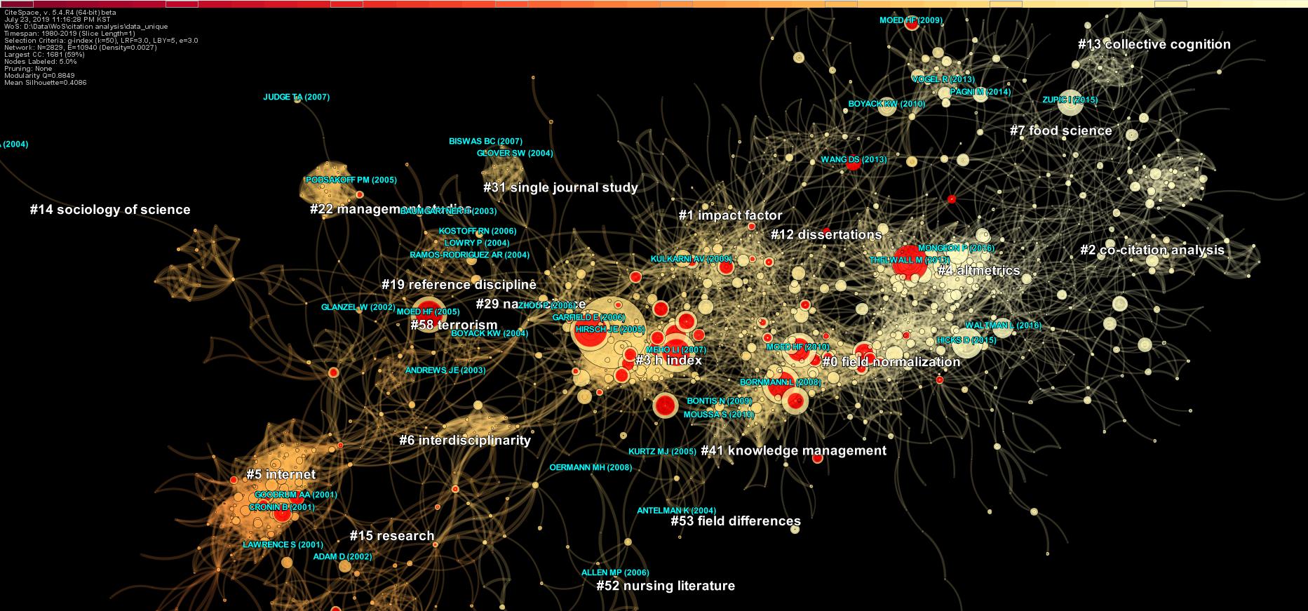
The next Cluster View of citation analysis research (1980-2019) uses the same constellation metaphor but creates a different visual experience. A large, luminous concentration dominates the center of the visualization, surrounded by smaller and more peripheral formations. Clusters emerge through proximity, density, connectivity, and shared visual characteristics rather than sharply defined boundaries. Large cluster labels serve as semantic landmarks, while prominent red tree rings draw attention to publications associated with citation bursts. The spatial and color patterns together invite the viewer to perceive the knowledge domain at several levels—from its overall core–periphery structure, to thematic concentrations, to individual publications of particular interest.
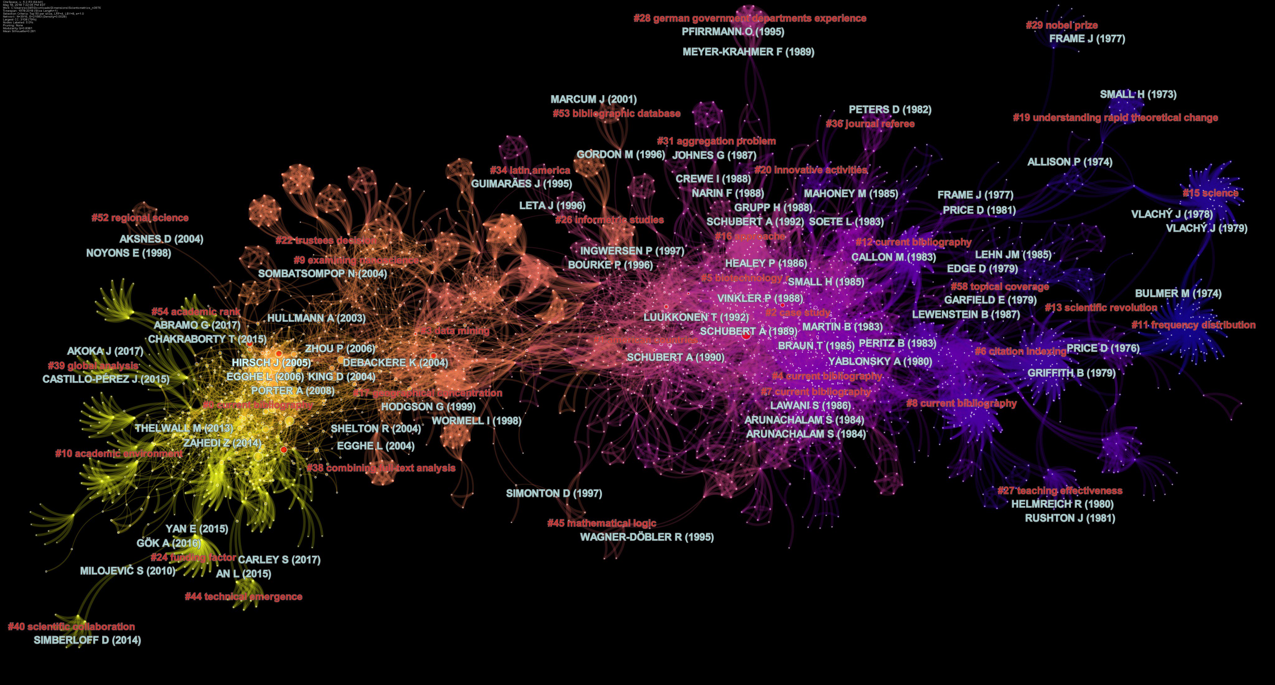
The visualization below is an earlier example of scientometrics (1978-2018), which illustrates another dimension to the visual language of a Cluster View: time. The network structure provides the spatial context, while colors encode when different parts of the network were active. As a result, the visualization can be read not only as a constellation of thematic concentrations, but also as a historical and evolutionary landscape. One can visually trace how attention moves from earlier regions of the network to later ones while retaining the connections between successive generations of research. It is important, however, not to interpret spatial position itself as time; temporal information is conveyed by color rather than by a horizontal time axis.
Cluster Dependency Links
Clusters in CiteSpace visualizations represent conceptual and historical concentrations of research topics. An important analytical goal is to understand how individual components contribute to the structure of a knowledge domain and, in particular, how one component is related to another. Cluster Dependency Links can be superimposed on a Cluster View to highlight dependency relationships among clusters.
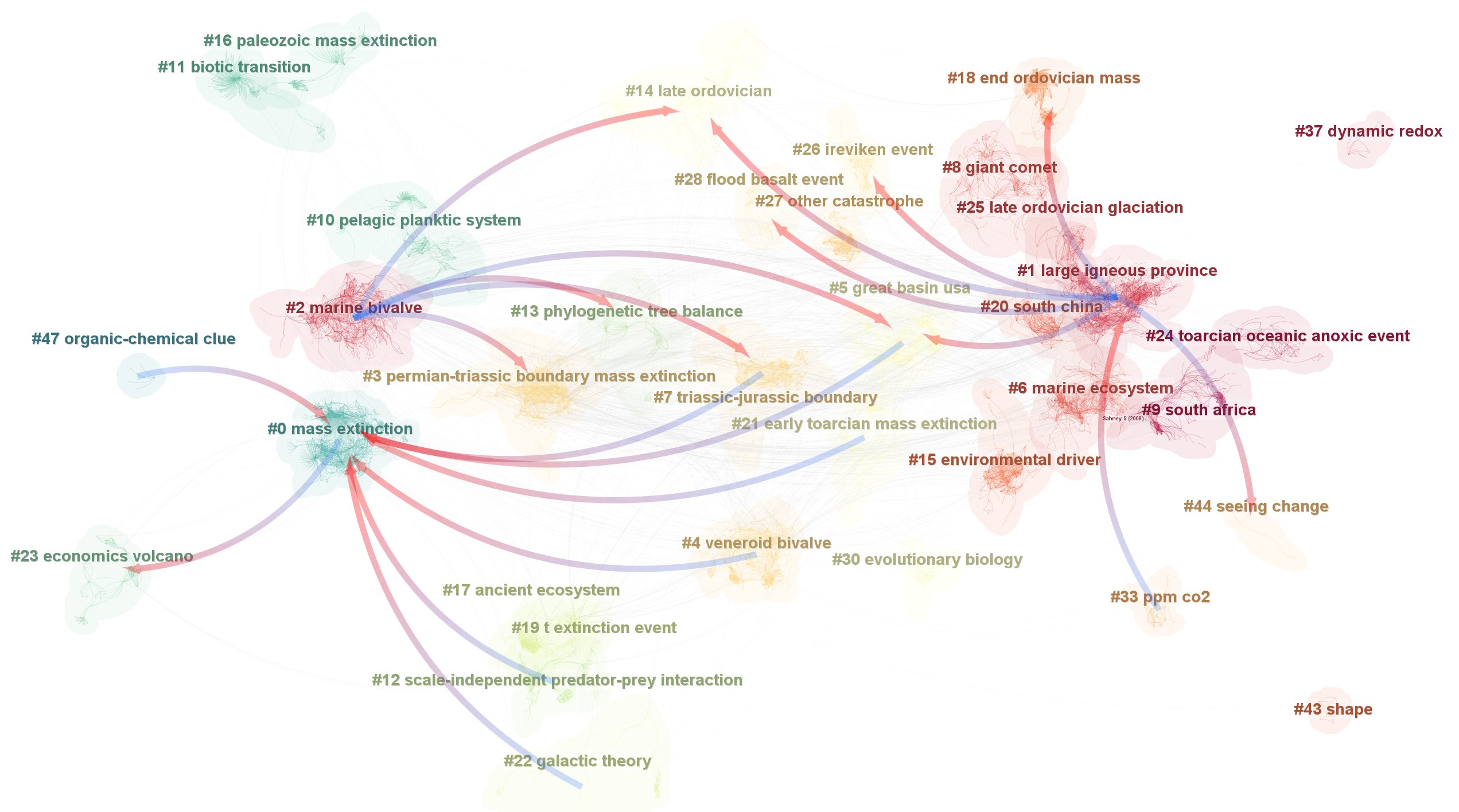
The visualization below depicts clusters of mass extinction research (1982-2021). Several clusters depend on the largest cluster, #0 mass extinction, as indicated by arrows pointing from these clusters to Cluster #0. More specifically, the citing articles associated with Cluster #0 subsequently became the members of newly formed clusters. In this sense, the newer clusters grew out of research that had drawn on the intellectual base represented by Cluster #0, and therefore can be regarded as depending on it.
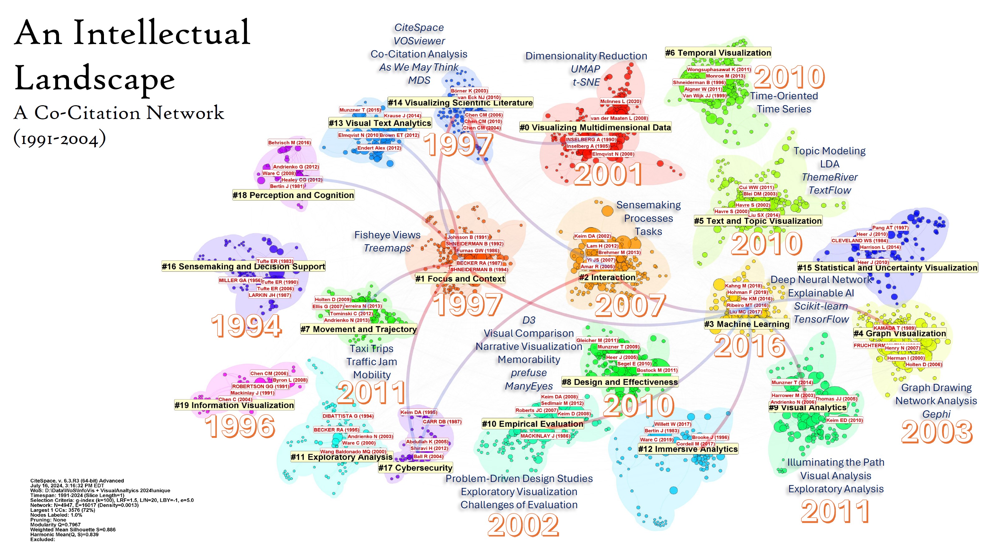
Cluster Dependency Links were similarly used in the following example of information visualization (1991-2024) from my keynote at the 28th International Conference on Information Visualisation in Coimbra, Portugal. The dependency patterns highlight several clusters that played particularly important roles in the development of the field, including #1 focus and context (1997), #2 interaction (2007), #3 machine learning (2016), and #14 visualizing scientific literature (1997). Cluster dependencies allow us to organize the clusters at a higher level—not only according to their individual topics, but also according to their roles in the development of the knowledge domain. In particular, they help distinguish between clusters that have exerted an influence on subsequent developments and clusters that have been influenced by earlier ones.
Making Sense of Clusters
Once we identify clusters as the building blocks of a knowledge domain, the next task is to understand what these clusters are about. CiteSpace supports several types of networks, and the interpretation of a cluster depends on the type of network from which it is derived. For example, a network of co-cited references and a hybrid network combining cited references with citing units, such as keywords, carry different meanings.
A good starting point is the cluster label. CiteSpace supports several methods for extracting meaningful terms to characterize a cluster. Additional evidence can be obtained from the publications and other elements associated with the cluster. CiteSpace can also generate cluster summaries through the GPT API.
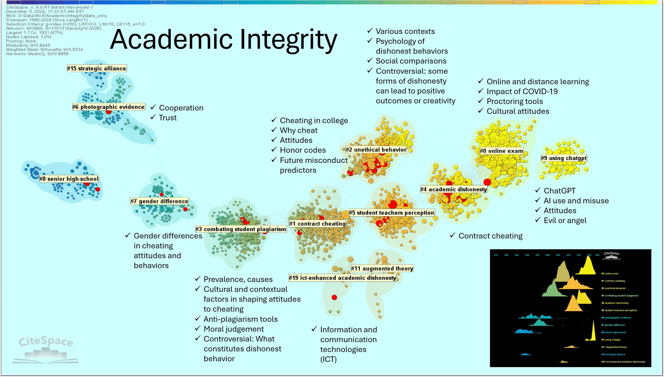
The first example below, on academic integrity (1980-2024), is a hybrid network of cited references and citing keywords. The duality between what is cited and how it is described by the citing literature can be particularly informative. For example, the largest cluster, #0 online exam, is further characterized by prominent keywords such as online and distance learning and impact of COVID-19. Taken together, these elements sharpen the interpretation of the cluster as academic integrity in the context of online examinations during the COVID-19 pandemic. Similarly, the meaning of #7 gender difference becomes more specific when its prominent citing keywords are taken into account: the cluster concerns gender differences in attitudes and behaviors towards cheating.
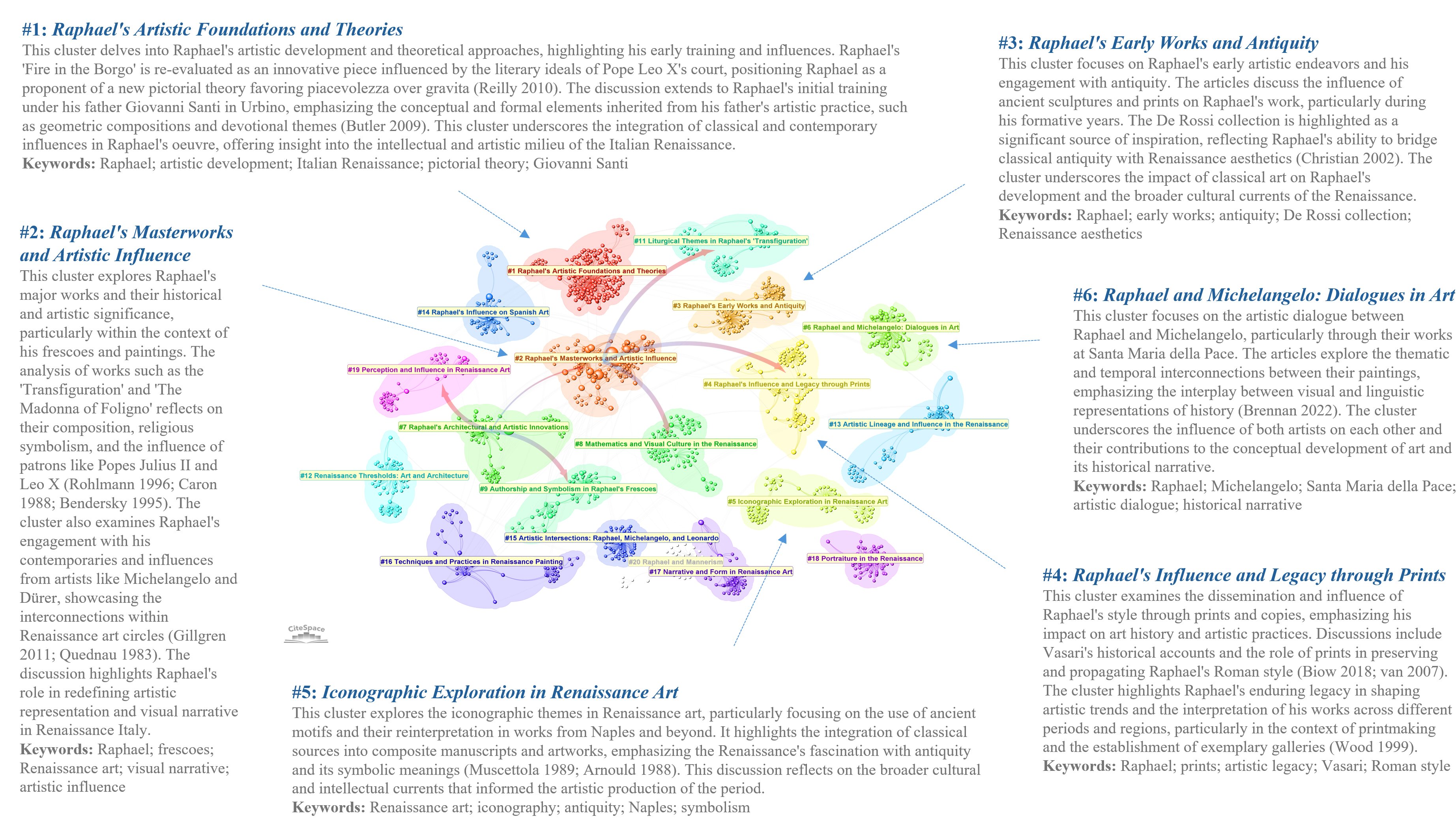
The second example extends the use of cluster labels and citing keywords in sensemaking to a more elaborated form of cluster summarization. The cluster labels and summaries shown below were generated by synthesizing multiple sources of information associated with each cluster. Prominent citing articles, major themes, and other salient features are organized into a cohesive account that provides a reference framework for interpreting the cluster. CiteSpace users can then examine the underlying evidence and develop their own assessments with reference to this framework.
The purpose of such summaries is not to provide a definitive interpretation, but to organize relevant evidence so that users can more efficiently develop and evaluate their own understanding of a cluster.
Making Sense of Pathways of Articles
As we zoom further into a Cluster View, another intuitive visual feature can become informative in guiding exploratory navigation between the cluster level and the article level: pathways of articles. The visualization below highlights pathways connecting potentially noteworthy nodes, particularly those with relatively high degree centrality. Rather than examining such nodes individually, we may also be interested in the paths that connect them and in the articles encountered along those paths.
Imagine a conceptual hierarchy: clusters → pathways → articles. A cluster tells us where a concentration of research lies; a pathway can suggest how noteworthy publications are connected through that intellectual space; and individual articles allow us to investigate what specifically gives rise to the observed pattern.
Pathways therefore provide a visual pattern at an intermediate level of analysis. They bridge the broader organization represented by clusters and the finer-grained relationships represented by individual nodes and links. In this way, a viewer can move progressively from clusters, to pathways within or across clusters, and ultimately to individual articles, using each level to provide context for the next.
Pathways may also reveal opportunities for further research. For example, highly localized or fragmented pathways may suggest weakly connected areas, missing links, or potential opportunities for integrating otherwise separated areas of research.
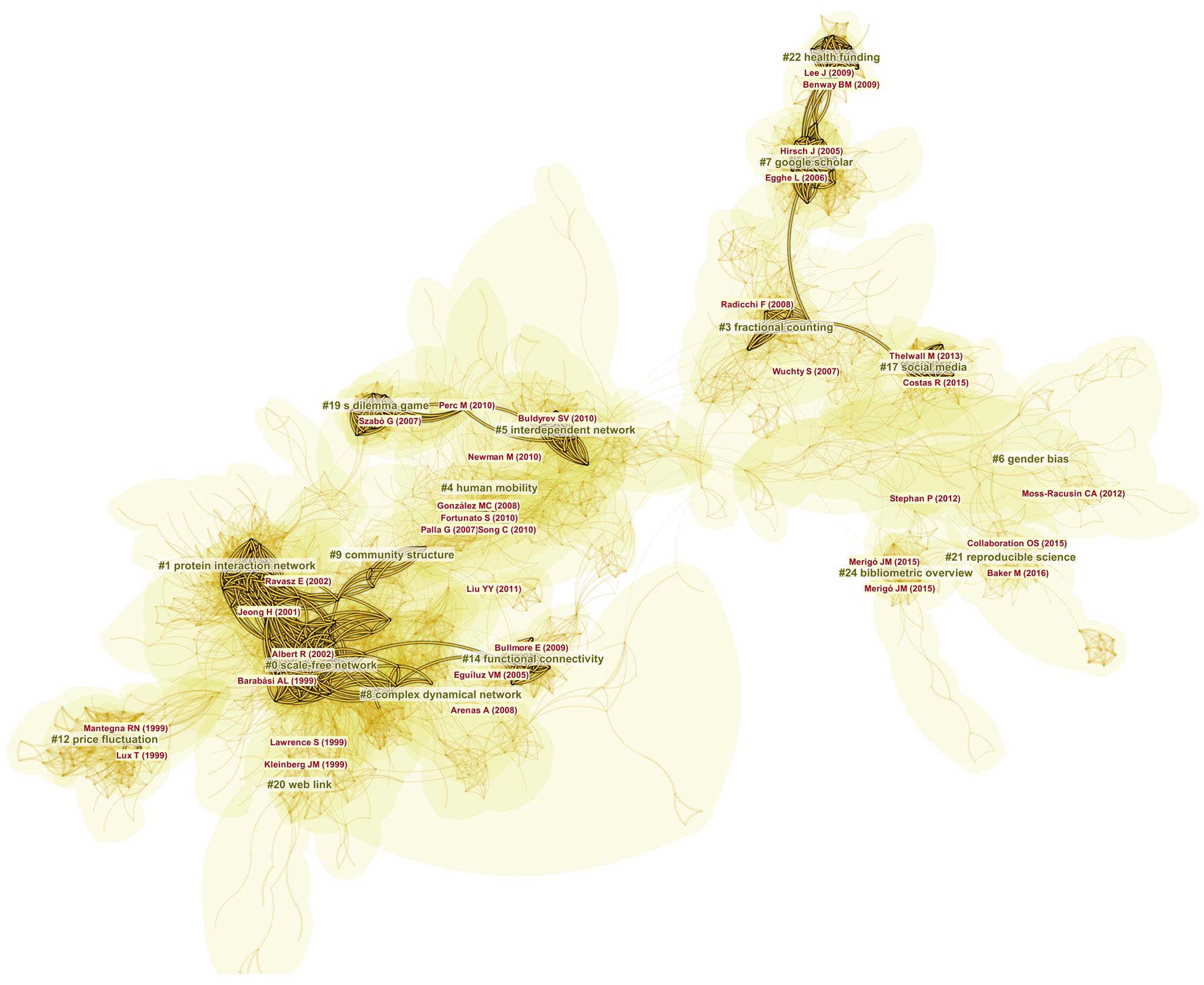
Here is another example (bibliographic mapping 1980-2022). Pathways are particularly interesting when they connect nodes with strong citation bursts, shown in red. Following the pathway links can lead us to the citing articles that made these connections, providing a concrete basis for understanding how otherwise separate influential publications became linked in the development of the field.
Circular View
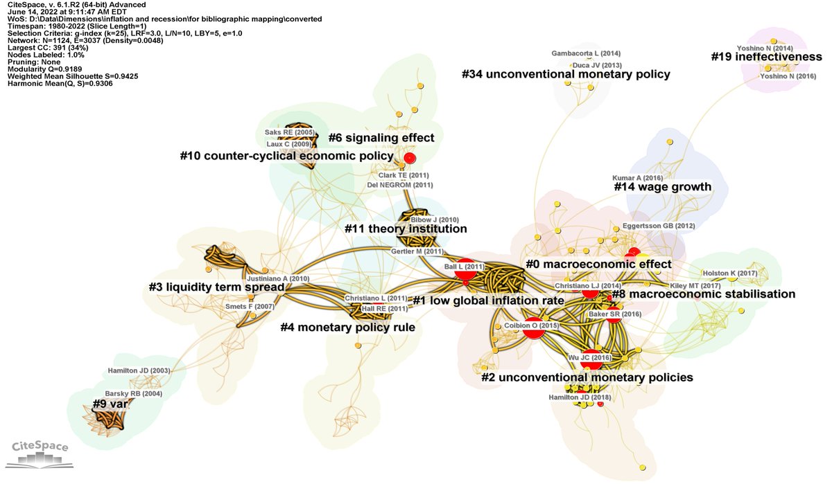
A Circular View arranges clusters around a circle. CiteSpace provides two layout options: the largest cluster can either be placed at the center or included with the other clusters around the circle. The remaining clusters are arranged clockwise in descending order of cluster size. Thus, the largest 25% of the clusters appear approximately between 12 o'clock and 3 o'clock on an imaginary clock face.
Compared with a Cluster View, a Circular View is often more compact and its spatial arrangement more predictable. The red stars in the following visualizations indicate results of a term search—for example, education or integrity. In a search expression, the vertical bar | denotes OR; for example, clinical | medical searches for either clinical or medical.
A Circular View is also well suited for displaying Cluster Dependency Links.
Timeline View
In a Timeline View, multiple clusters are depicted as parallel streams running from the past on the left toward the present on the right. This arrangement makes it easier to recognize different stages in the lifecycle of a cluster and to compare its development with that of other clusters in the same knowledge domain.
A Timeline View is particularly useful for questions such as:
Which clusters emerged earliest? How long did they remain active?
Which clusters contain many articles with strong citation bursts?
Are there clusters with many bridge nodes—that is, nodes with high betweenness centrality?
Which clusters remain active today?
By aligning clusters along a common temporal direction, the Timeline View makes the birth, growth, persistence, decline, and possible renewal of clusters easier to recognize than in a conventional Cluster View.
Here is a Timeline View visualization of Terrorism (1990-2023).
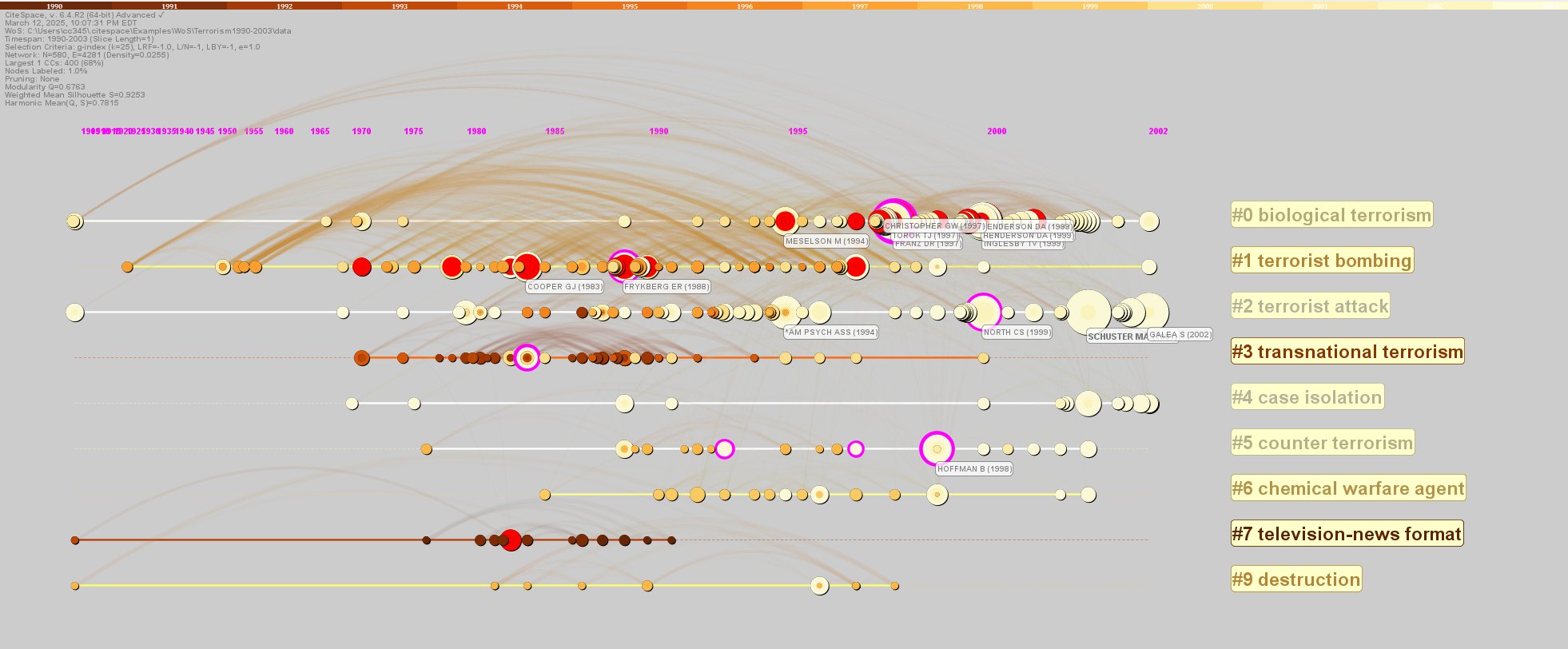
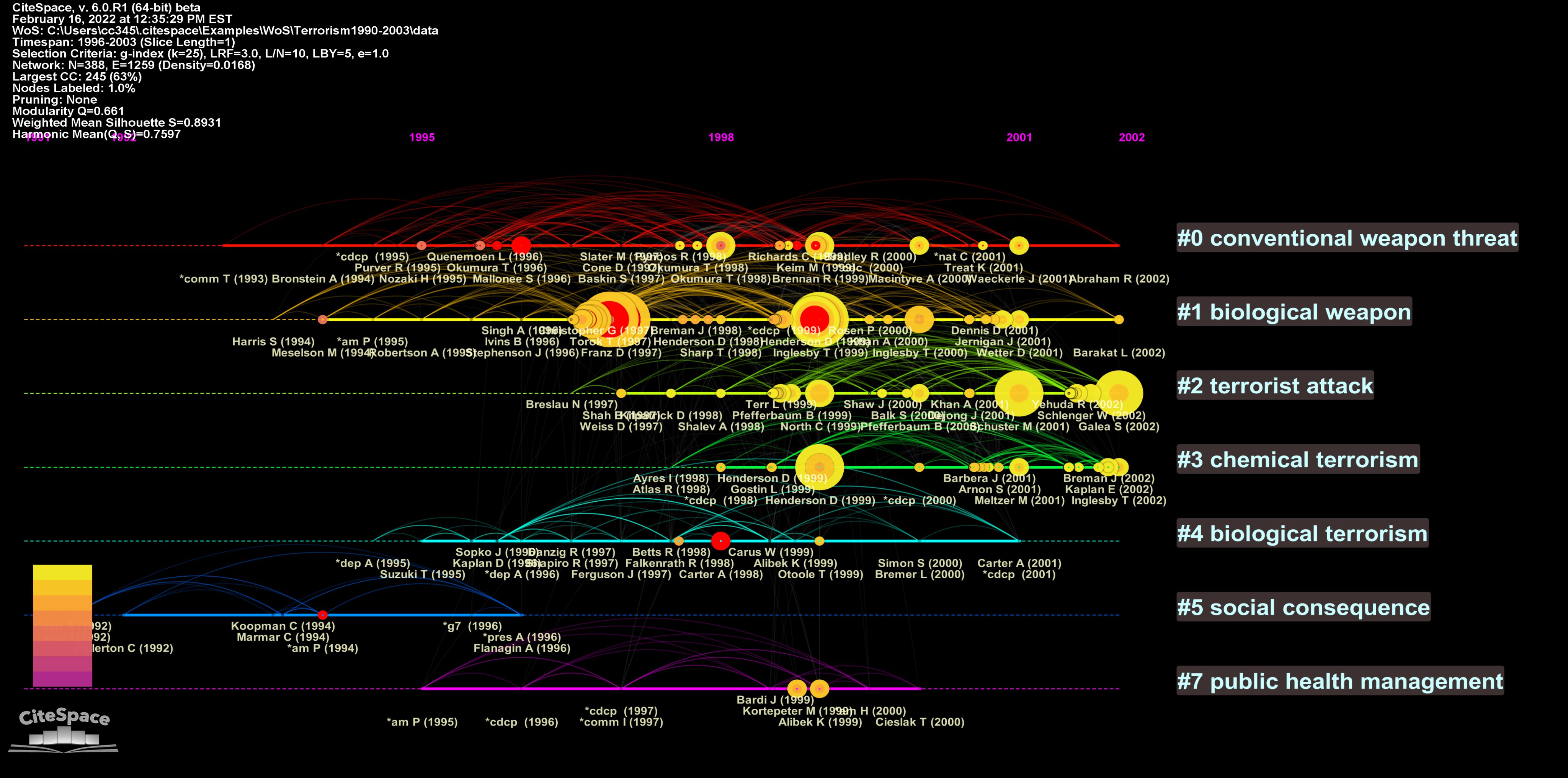
It is quite common for the scholarly literature of a knowledge domain to grow much faster in recent years than earlier years. Note that the nodes in the Timeline View below are not distributed evenly according to their years of publication. Some years occupy a disproportionately larger area of the display than others. This is the fisheye view effect in CiteSpace.
The fisheye view allows users to locally enlarge a particular year and its neighboring years while compressing more distant periods. This makes it easier to inspect dense recent activity and reduce what might otherwise become an overcrowded visualization. In this example, the visualization focuses on the period between 1998 and 2001. The corresponding portion of the timeline is horizontally expanded, providing more space for nodes, links, and labels to be displayed clearly. The surrounding years remain visible but occupy less space, preserving the broader temporal context while bringing the selected period into focus.
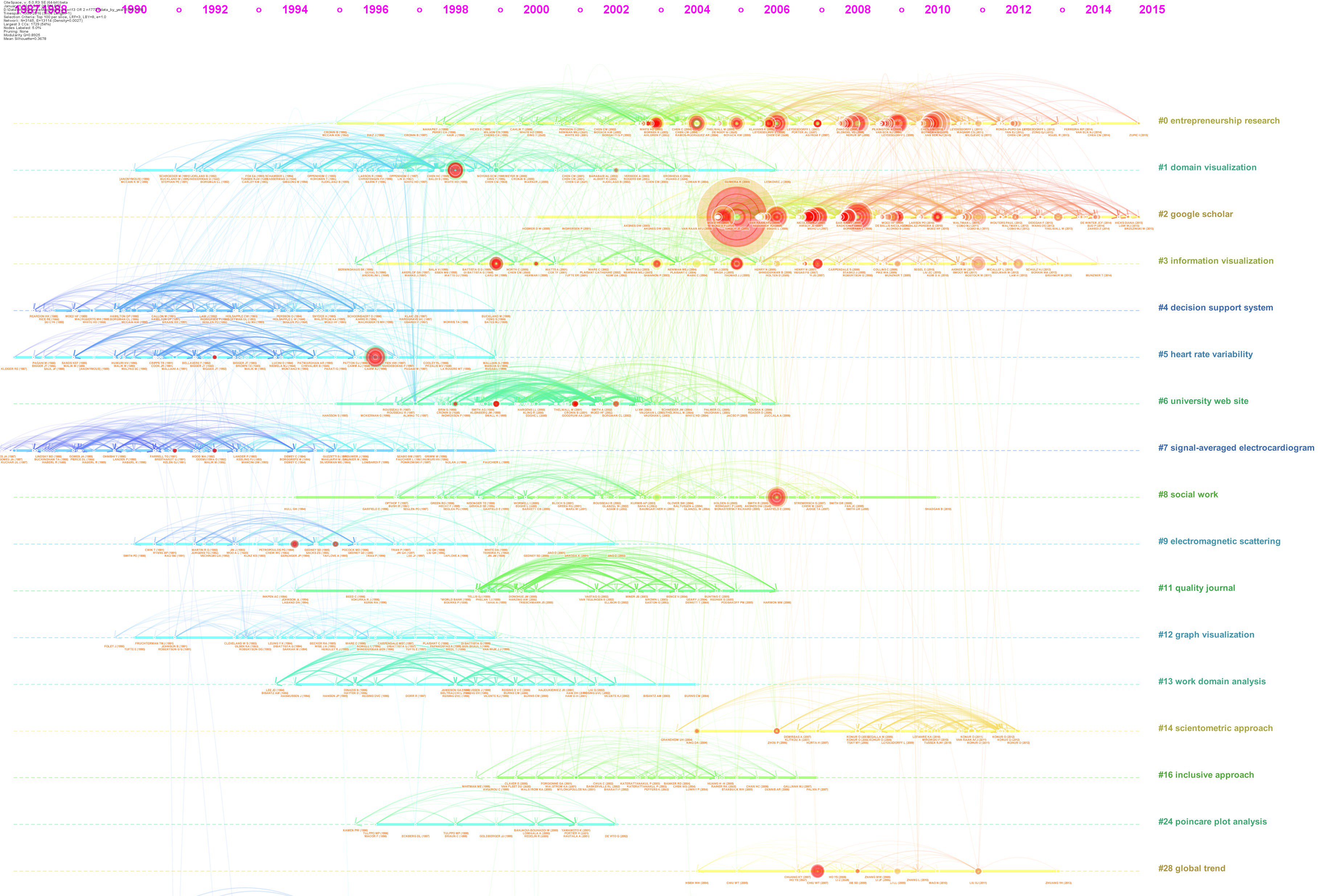
The Timeline View visualization below was included in my 2017 paper. The rises and falls of several clusters correspond quite well to the four-stage model proposed by Shneider. In essence, the four-stage model describes a problem-solving process at a broad level. It begins with a conceptualization stage, in which key research questions are defined, followed by a tool-building stage, an application stage, in which the newly developed tools are put to use, and finally a codification stage, in which researchers reflect on what has been learned, consolidate their knowledge, and, ideally, become wiser.
In this example, the blue clusters emerged earlier and helped set the stage for subsequent developments. The two green clusters near the top feature the development of tools, while the more recent red clusters highlight the then-current stage of the research field—science mapping. Viewed in this way, the Timeline View provides more than a chronological display of clusters: the rise and fall of clusters can be interpreted in relation to a broader model of how a field develops.
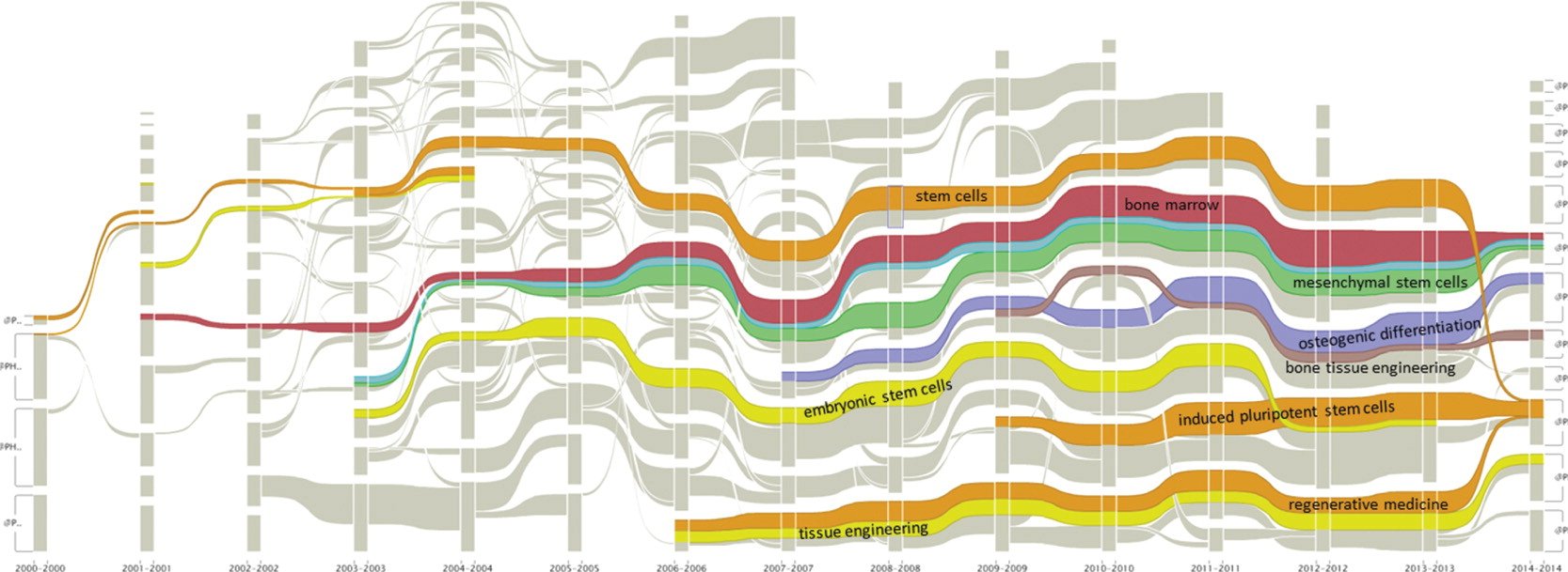
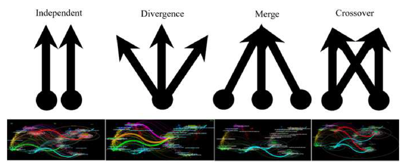
The next visualization is an alluvial flow. Although it is not a Timeline View per se, it serves similar purposes and can be interpreted through many of the same temporal patterns. Whereas a Timeline View emphasizes the lifecycles of clusters along parallel temporal streams, an alluvial flow emphasizes continuity and transformation across time, making it particularly intuitive to follow how areas of research persist, expand, contract, split, merge, or give rise to new areas.
Landscape View
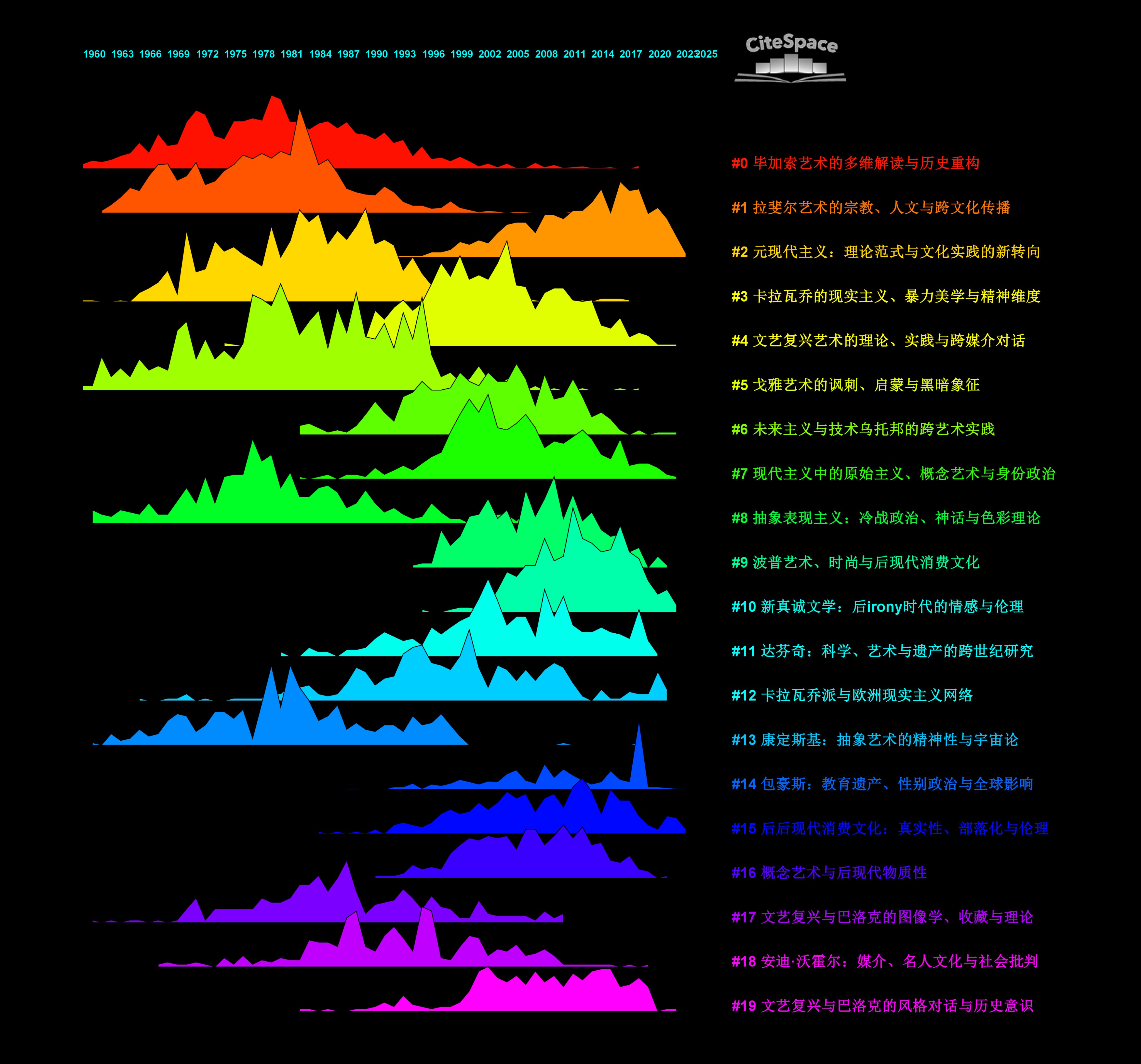
Landscape Views share the temporal focus of Timeline Views. A Landscape View depicts how the volume of a cluster changes over time. Its mountain-like skyline makes the history of a cluster intuitive to grasp at a glance. Some clusters may rise sharply as steep peaks, while others form sustained ridges extending over many years. Still others may be relatively transient, appearing briefly before fading away.
It can also be informative to identify clusters whose profiles appear to move together over time. Similar rises and falls may suggest that the corresponding areas of research are responding to common developments, interacting with one another, or evolving in parallel. Nevertheless, do not jump to conclusions: synchronized patterns are signals worth investigating, not proof of a relationship.
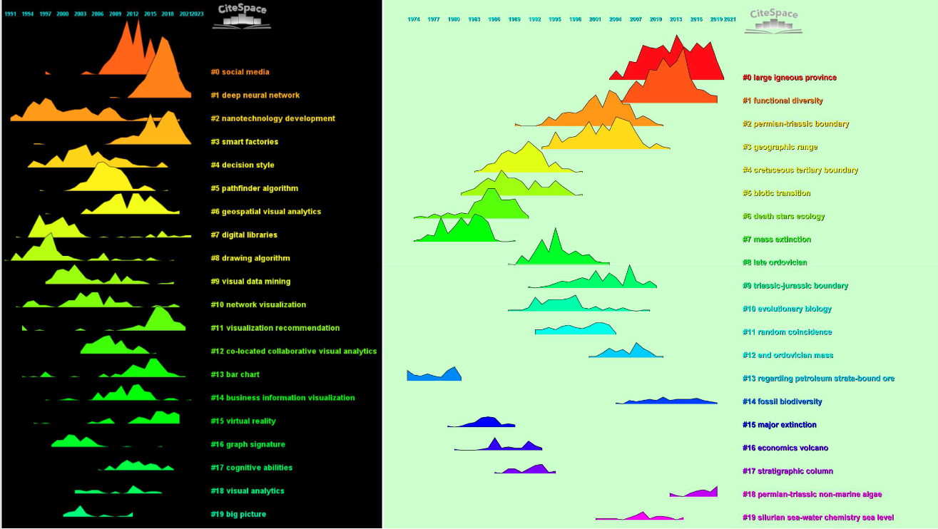
The visualization below depicts research in the history of art. Clusters #0, #1, #3, #5, #8, and #13 were largely active over the same period, roughly from 1960 to 1995, whereas #2 and #10 are still going strong today.
The next two examples visualize the landscapes of two different knowledge domains—inflation/recession and terrorism. Comparing Landscape Views across different domains draws our attention to an important recurring pattern. Regardless of the underlying domain, a knowledge domain can often be seen as a dynamic combination of multiple parallel streams of research. Each stream, or cluster, has its own thematic focus, preferred intellectual base, and researchers or publications at the research front.
Furthermore, if we apply the same visual analytic methodology to an individual cluster, we may encounter similar patterns again at a finer level of granularity. Repeating this process recursively allows us to construct a hierarchy of visualizations, moving from a knowledge domain to its clusters, from a cluster to its substructures, and potentially to still finer levels. This approach can be particularly effective for breaking down a large or complex cluster into more interpretable components. In this sense, the visual language of CiteSpace is recursive: similar structural and temporal patterns may reappear as we move from one level of analysis to the next.
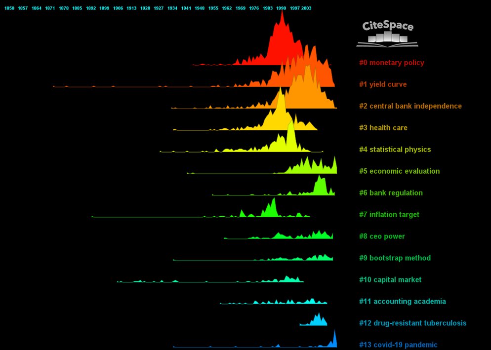
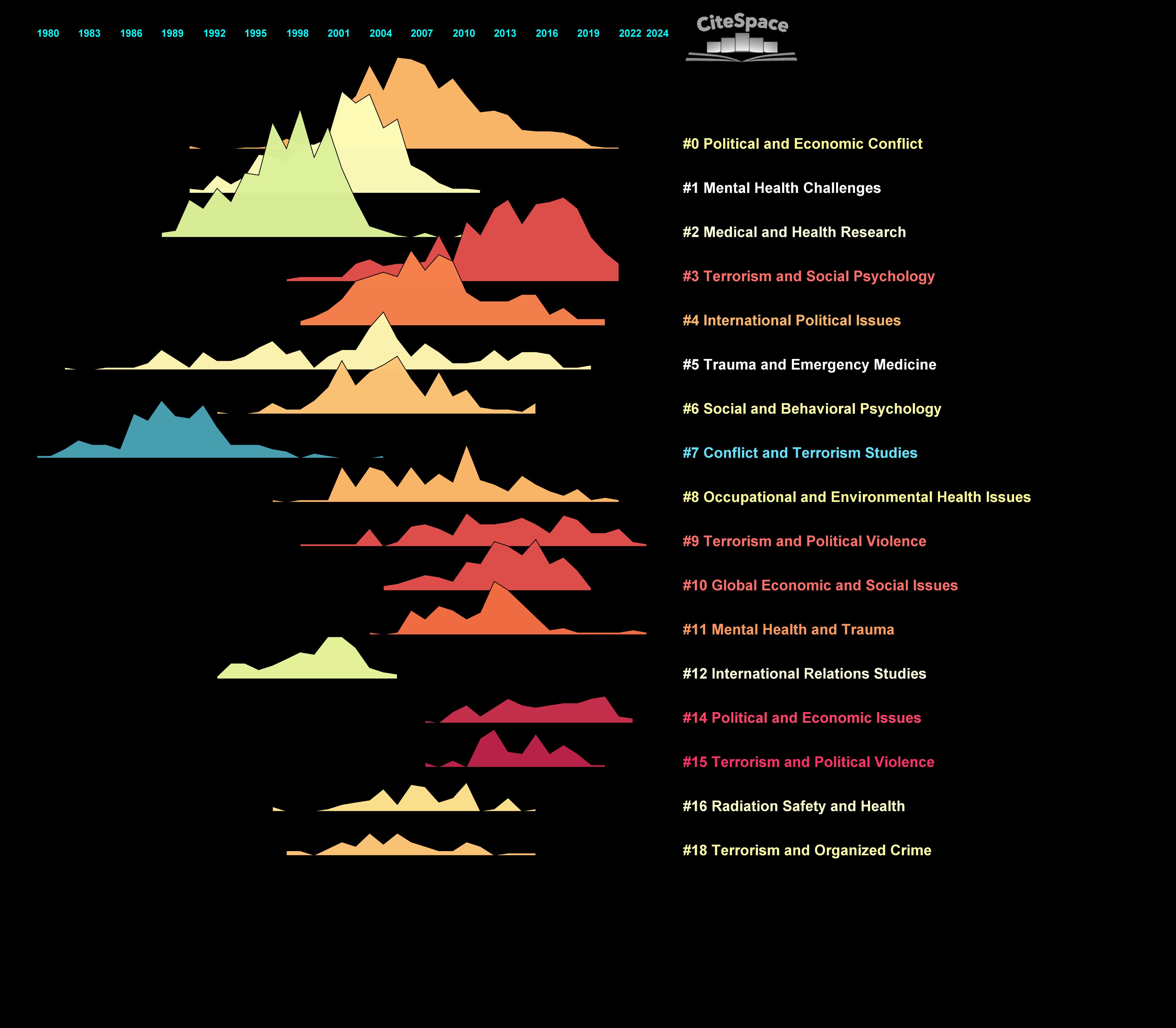
Realizing that a knowledge domain can be decomposed into clusters representing relatively self-contained streams of research—and that these streams can in turn be decomposed at finer levels of granularity—is conceptually rewarding. It suggests an observable mechanism for understanding complex processes such as interdisciplinarity and, more pragmatically, may offer constructive ways to push research frontiers forward. The recurring temporal patterns point to a concrete mechanism in which component streams from different knowledge domains may serve as candidates for recombination, potentially giving rise to new areas of research. This could be a big deal, especially in light of the challenges identified by the NSF TRACES Project and other pioneering efforts to understand how major scientific advances emerge. We will revisit this mechanism in greater detail when we introduce Dual-Map Overlays.
Burst History View
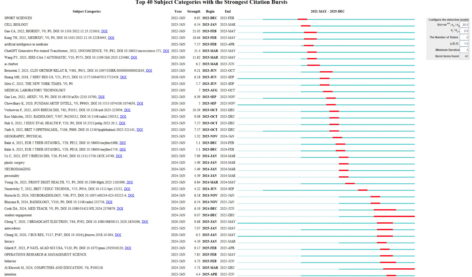
Temporal dynamics of a knowledge domain can also be visualized at the article level in a Burst History View. The default unit of analysis is the citation burst of a cited reference. More broadly, burst detection can be applied to changes in the occurrence frequency of other node types, such as keywords, authors, and institutions. For example, a keyword with a strong burst may indicate a rapidly emerging topic, whereas a burst associated with an author or institution indicates a sharp increase in the number of publications associated with that author or institution.
The duration of a burst is depicted as a red bar embedded in a blue line representing the item's history since its initial appearance. The length of the red bar indicates the duration of the burst period. We may pay particular attention to sequences of short, successive bursts, which suggest rapid shifts of attention, as well as to items whose bursts persist for many years.
Sometimes it is also revealing to ask whether the pace of these shifts itself changes abruptly—for example, whether a field moves from relatively long periods of sustained attention to increasingly rapid turnover. Can you spot such turning points in the example below?
Uncertainties of Citation Contexts
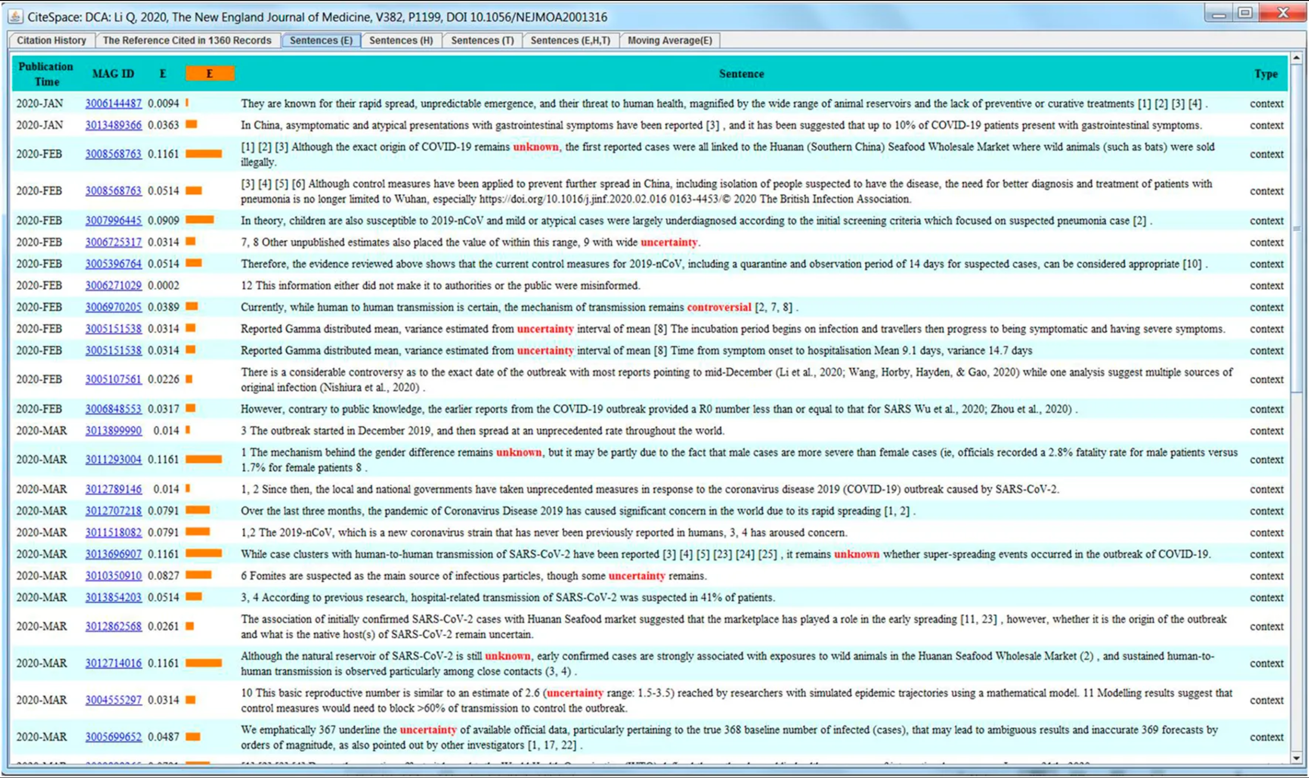
Uncertainties in citation contexts provide an additional perspective on the state of knowledge and the stage of research. By its nature, research must engage with questions that contain a sufficient degree of uncertainty; otherwise, a study may be regarded as trivial, insufficiently challenging, or simply not interesting enough. The language used to express uncertainty can therefore reveal a great deal about an author's position between the known and the unknown. That position may range from something plainly unknown, to something controversial, tentative, conditional, or otherwise uncertain in more specific ways. Examining such expressions can tell us not only how uncertain we know, but also what kind of uncertainty is involved.
Dual-Map Overlays
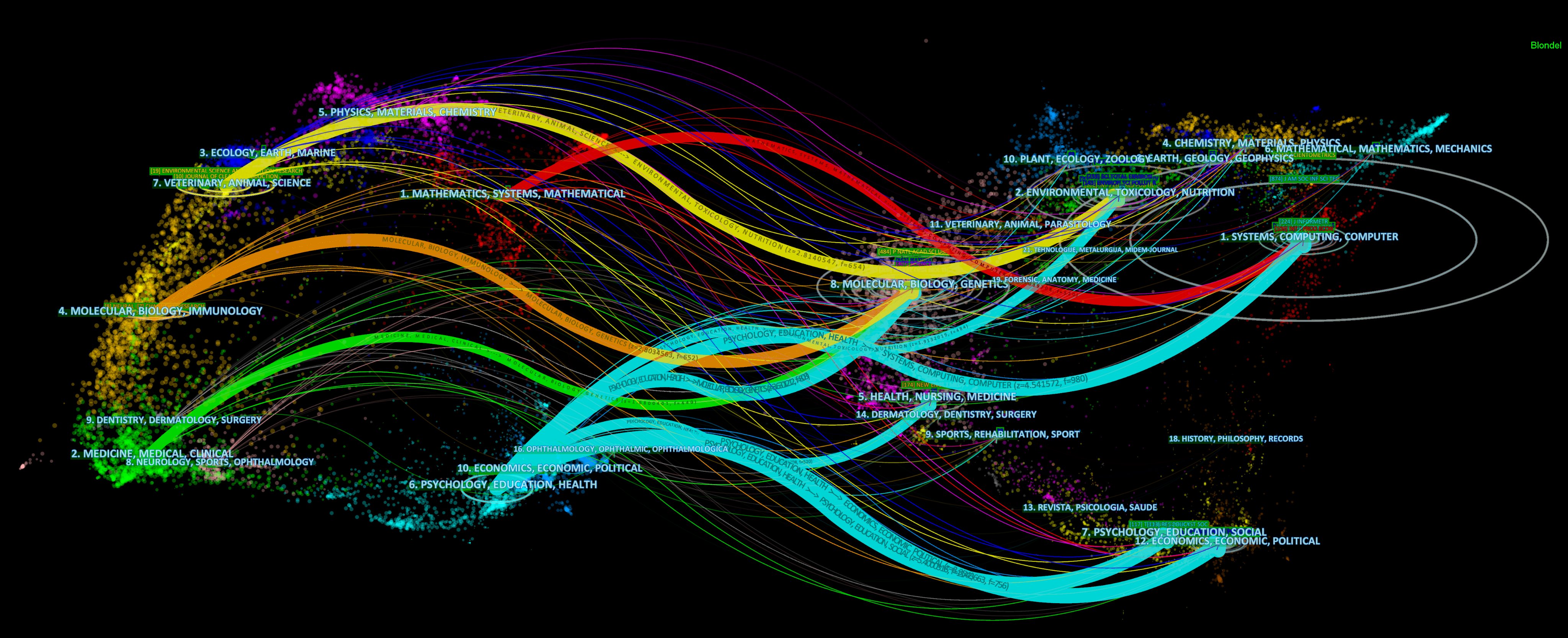
As promised, let us now look at what Dual-Map Overlays can tell us. A Dual-Map Overlay visualizes patterns and trends at the journal level. It consists of two base maps—hence the term dual map. The map on the left represents citing journals, whereas the map on the right represents cited journals. Overlays derived from a user's own dataset are then superimposed on these two base maps. Journals on each base map are grouped into broad disciplinary areas with labels such as 1. MATHEMATICS, SYSTEMS, MATHEMATICAL. Wave-like paths connect citing areas on the left to cited areas on the right, showing which groups of citing journals draw on which groups of cited journals.
The example below visualizes the citation paths made by 17,780 publications that cited Thomas Kuhn's work The Structure of Scientific Revolutions (1962). This Dual-Map Overlays is telling us which disciplines talked about Kuhn's work in their narratives. In this example, two red paths originate from the same citing area but terminate in two different cited areas. Similarly, the cyan paths originate from a single citing area but fan out across at least five areas of cited journals. In contrast, the yellow path is essentially a one-to-one mapping, originating from one area and terminating in a single area.
These contrasting patterns provide clues about interdisciplinarity. The cyan pattern suggests a research area drawing on a more diverse range of disciplinary knowledge bases than the red pattern, whereas the one-to-one yellow path appears comparatively more self-contained. Thus, the degree to which citation paths fan out across multiple disciplinary areas can provide an intuitive indication of how broadly a field draws on knowledge from other domains.
As rigorous as we should be in interpreting visual patterns, however, a broader spread of citation paths should be treated as candidates—or even suspects—for further investigation and verification, rather than as conclusive evidence of interdisciplinarity.
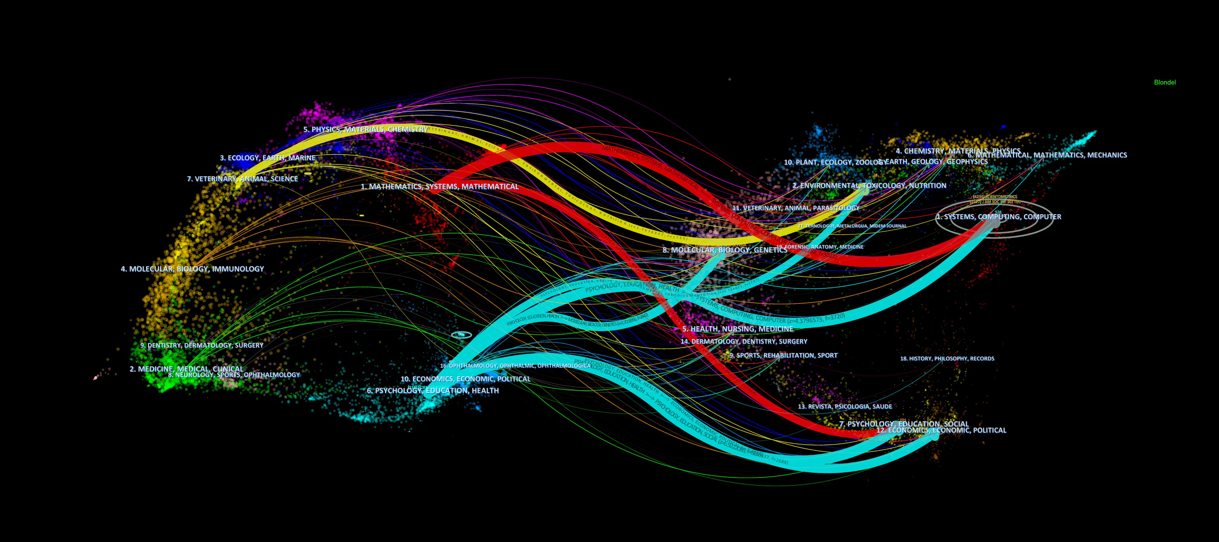
The next example depicts journal-to-journal citation paths formed by publications that cited CiteSpace. It simultaneously reveals which disciplinary areas have prominently cited CiteSpace and which areas of knowledge they have drawn upon as their intellectual bases.
Concept Tree View
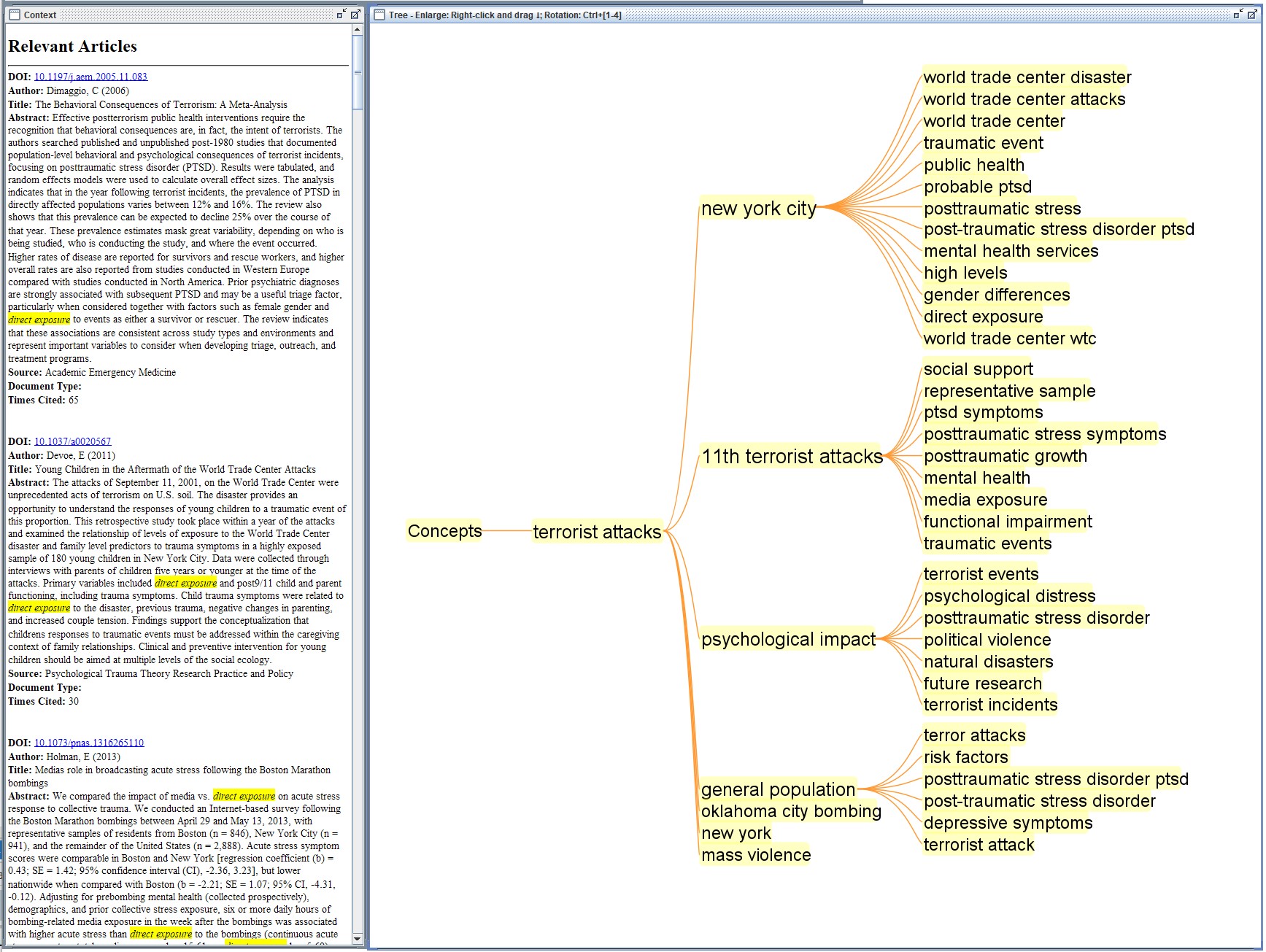
Concept Tree View visualizations are suitable for exploring patterns at the concept level. Concepts can be regarded as a level below individual articles, yet they can also transcend the artificial boundaries imposed by articles, journals, and other types of scholarly “containers.”
A concept tree is initially laid out horizontally from left to right, with its root on the left. Its hierarchical structure makes it easy to move among concepts at different levels of granularity. For example, in the visualization below on terrorism research, one prominent path follows terrorist attacks → New York City → World Trade Center disaster / post-traumatic stress disorder / direct exposure.
Exploration at this level can be particularly informative because it allows us to cross-reference different points of interest and connect the dots among related concepts. The Concept Tree View also serves as a gateway back to the articles in which these concepts were discussed. For example, the titles and abstracts listed in the right-hand panel below all specifically mention the phrase direct exposure.
Density Views
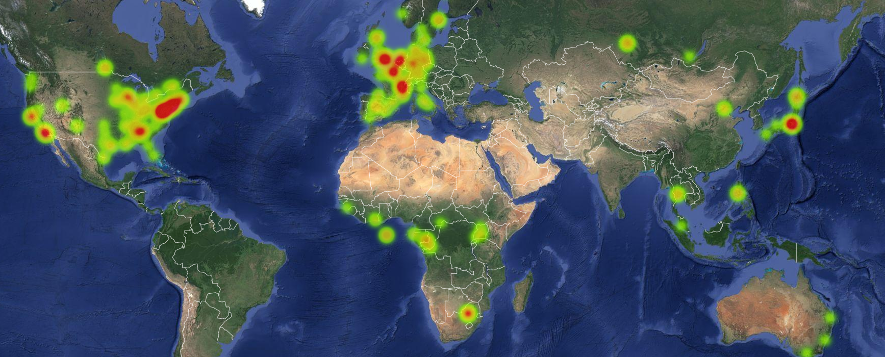
The geographic distribution of domain experts—in this case, authors of peer-reviewed publications on Ebola—can be valuable for researchers seeking expert opinions, identifying centers of expertise, or exploring opportunities for collaboration. Perhaps equally important, if not more so, is the ability to identify geographic gaps: areas where few or no nearby researchers have published on Ebola or related topics. Such gaps may reveal disparities in the geographic distribution of relevant research expertise and raise questions worth further investigation.
A little interpretive caution goes a long way: what is visible depends on the dataset at hand. An area with no observed density simply indicates an absence of relevant records in the data; it does not necessarily mean that no expertise can be found in that area.
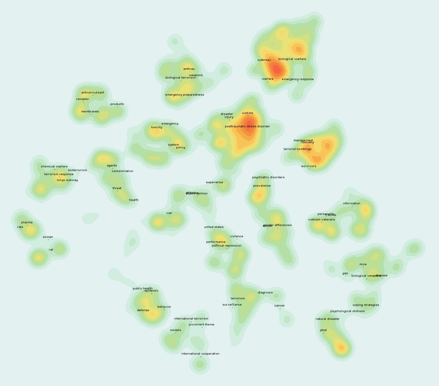
Heatmap Views in CiteSpace are similar to density overlays on a geographic map, except that the underlying geographic layout is replaced by the spatial distribution of nodes in a network. As shown in the following example, a Heatmap View makes it easier to see how node density is distributed across a cluster configuration.
It can help address questions such as: Which clusters contain particularly dense concentrations of nodes? Where are the major hotspots within the network? A dense group of nodes indicates that the corresponding items tend to appear together frequently, for example through co-citation or co-occurrence, depending on the type of network being visualized.
Multi-Level Hierarchical View
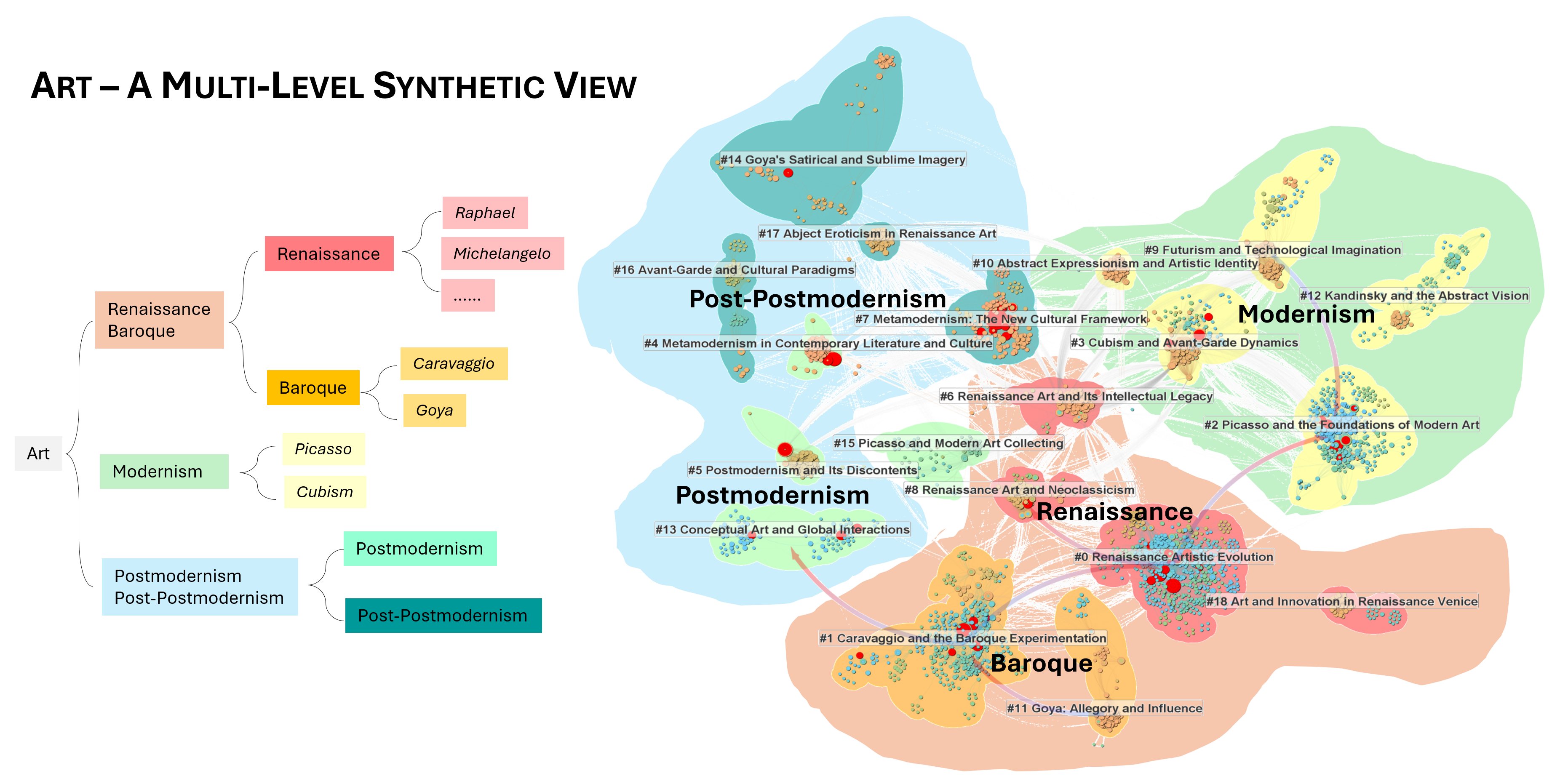
CiteSpace visualizations can be understood as part of a hierarchical organizational structure. Clusters that share a broader overarching theme may themselves be grouped into a supercluster at a higher level of aggregation. The following example from research on Art illustrates such a multi-level organization of the scholarly literature within a knowledge domain.
At the cluster level, relationships between topics such as Renaissance and Baroque are visibly strong, as indicated by the numerous inter-cluster links connecting them. Similarly, several clusters share the broader theme of modernism and form a tightly connected cluster of clusters—a supercluster.
This higher-order organization can be represented explicitly as a hierarchy, as shown in the diagram on the left. Alternatively, it can be visualized spatially by grouping clusters into superclusters when their internal inter-cluster linkages are relatively stronger than their linkages to clusters outside the group. In this sense, the same organizational principle can recur at multiple scales: nodes form clusters, clusters form superclusters, and still broader structures may emerge at higher levels of aggregation. This intuition fits naturally with a universe metaphor deeply rooted in how we perceive complex structures: from stars to constellations and galaxies, and from galaxies to groups, clusters, superclusters, and still larger structures.
Detecting Early Signs of Transformative Change
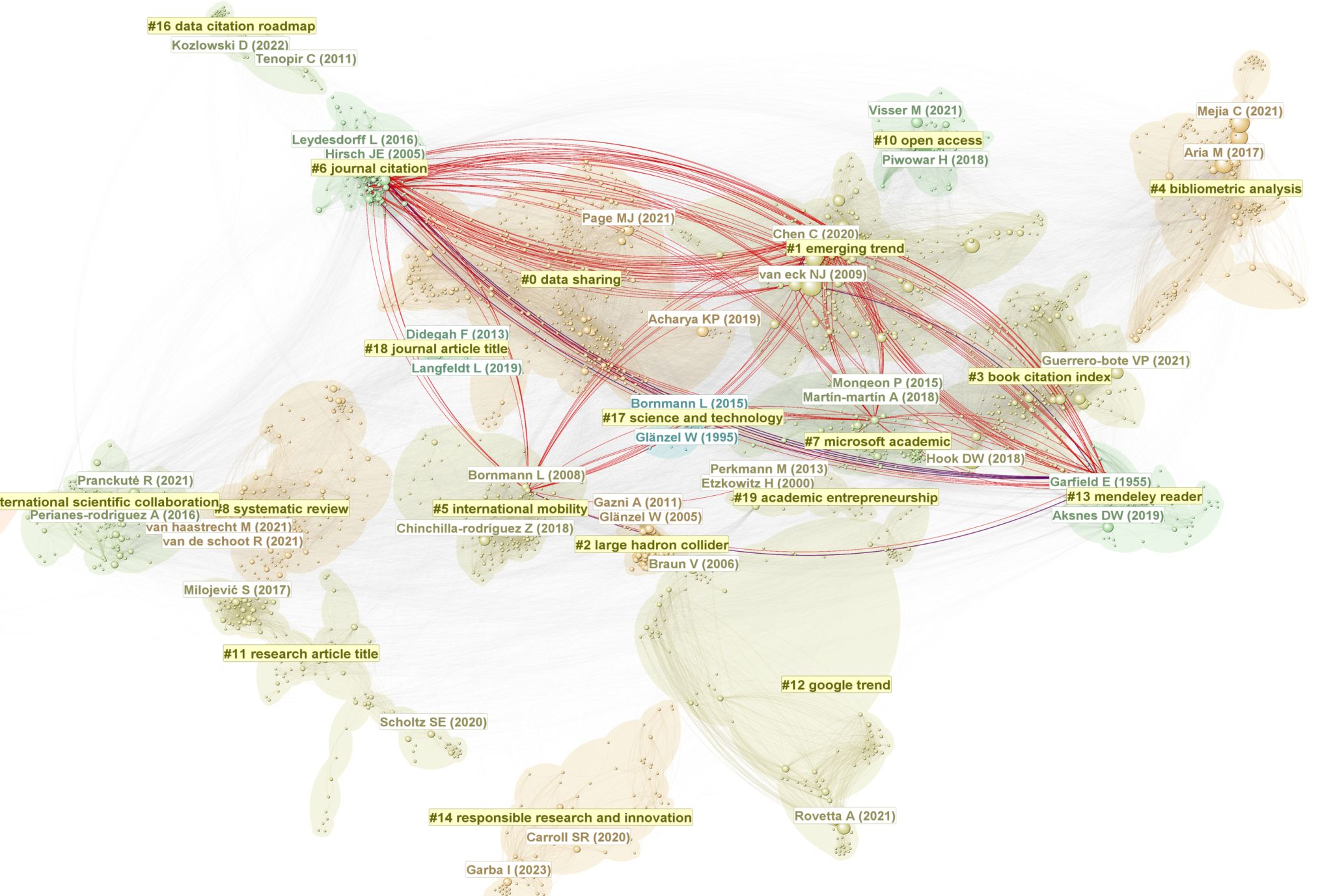
The concept of transformative potential is central to Structural Variation Analysis (SVA) in CiteSpace. The rationale is straightforward. As we have seen, one recurring mechanism of scientific advance is recombination—bringing together previously disparate areas of research. The earliest moves that establish such connections can therefore be especially important: they are often creative, and their consequences may eventually become transformative. The sooner we can detect early signs of these moves, the more useful they may be for identifying competitive opportunities, boundary-spanning developments, or even the beginnings of a paradigm shift.
The primary goal of SVA is to detect currently disparate areas of research that may be undergoing a transformative process. If such processes continue, the structure of the knowledge domain may eventually be fundamentally altered. In the example below, clusters #1, #6, #7, #13, and, to a lesser extent, #5 currently remain distinct concentrations of research. The transformative potential is represented by what the red links signify: they appear to mark profound boundary-spanning connections that may continue to strengthen, eventually tying these clusters together in ways not previously seen in the relevant literature.
SVA can be particularly valuable in directing our attention toward boundary-spanning and potentially transformative moves that transcend our usual intellectual boundaries and comfort zones.
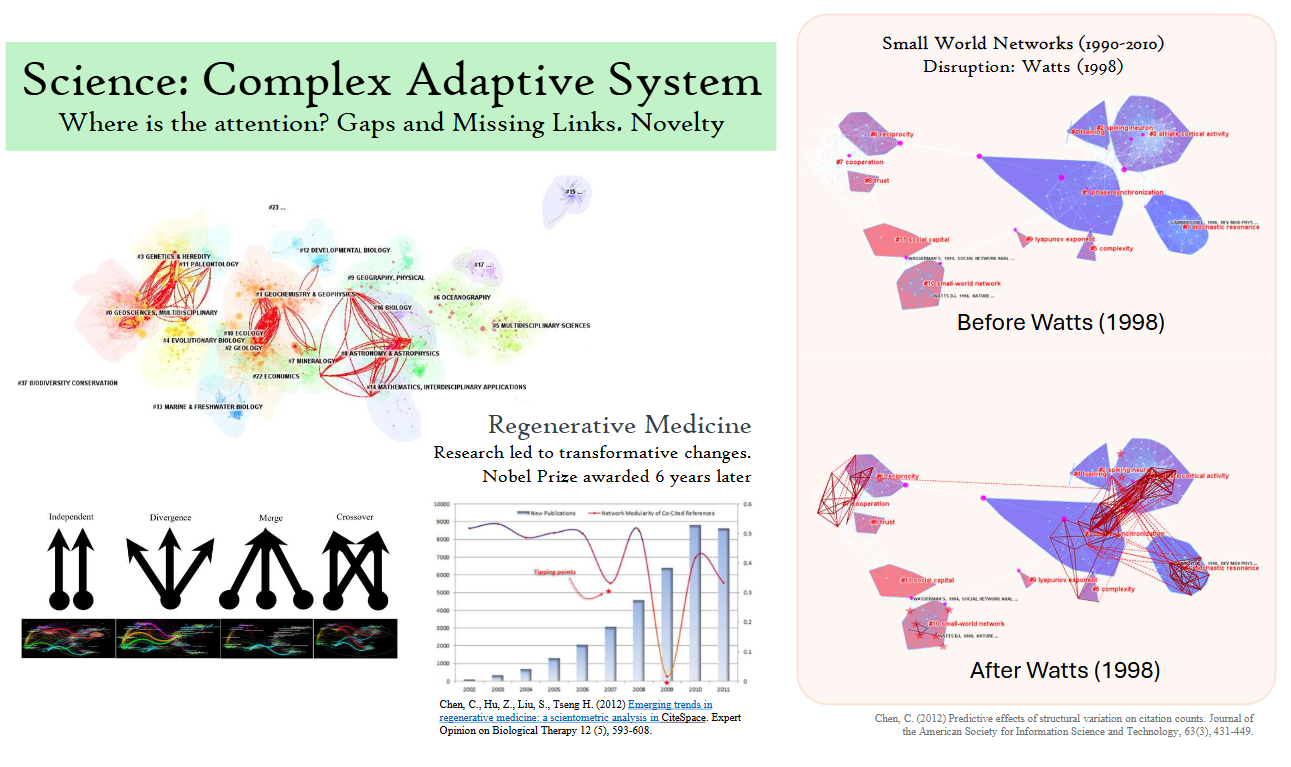
The following images illustrate several types of early signs of system-level structural change. A rigorous caution is essential, however: such signals may satisfy necessary conditions for transformative change without being sufficient to establish that transformation will actually occur.
In the example on the left, dense patches of red links appear between several otherwise distinct clusters. In other words, connections among these clusters strengthened considerably during a particular period, as revealed through the Link Walkthrough function in CiteSpace. The example on the right shows more directly which clusters were being stitched together. Over time, these clusters eventually merged into a newly integrated cluster.
One way to imagine this process is almost as the reverse of continental drift. Instead of one large continent breaking apart and its fragments drifting away from one another, multiple intellectual “continents” are progressively drawn closer together until they eventually become structurally integrated.
When structural changes of this magnitude occur, global measures such as the modularity of the corresponding network may fluctuate substantially, as illustrated in the bar chart below. Such indicators can alert us that something significant is happening at the system level, although they do not necessarily tell us exactly what has changed. Even that early awareness—knowing that the structure of the system has shifted in an unusual way—can itself be highly valuable. In the example below, the underlying development ultimately proved to be Nobel Prize worthy.
Taken together with what we can observe through Cluster Views, Landscape Views, and Dual-Map Overlays, as well as interactive functions such as Link Walkthrough and Cluster Dependency Links, SVA gives us another way to monitor the evolving structure and dynamics of a knowledge domain—especially when we are interested in detecting potentially transformative changes as early as possible.
Visualizations before CiteSpace
The examples below predate CiteSpace, but they reveal considerable continuity in their design rationale and in the underlying intuition about the intellectual space of a knowledge domain. Insights gained from these earlier visualizations subsequently contributed to the development of CiteSpace.
As you examine them, let's call them A, B, C, and D, consider two questions. Which metaphors and interpretive frameworks have been retained in CiteSpace, and which have been replaced or evolved into something different? More importantly, can you work out what these visualizations mean without any explanation from me?
If you can, that may tell us something about how much of the visual language is carried by familiar perceptual metaphors rather than by explicit instructions.
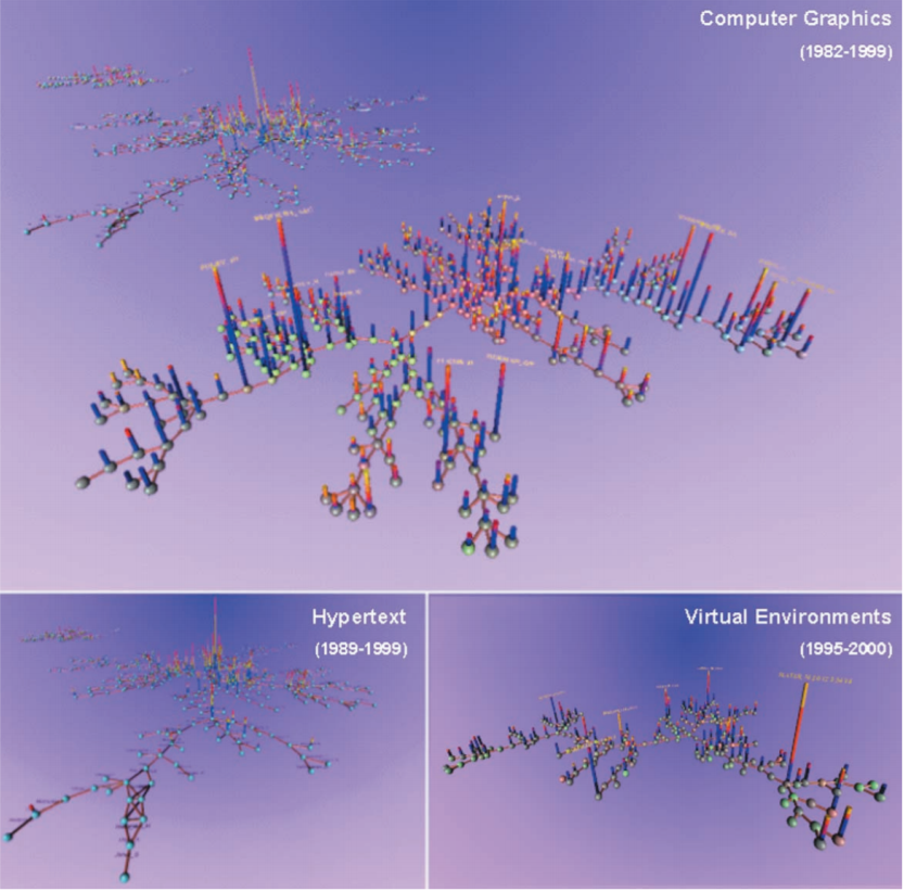
A: Are there any patterns that stand out?
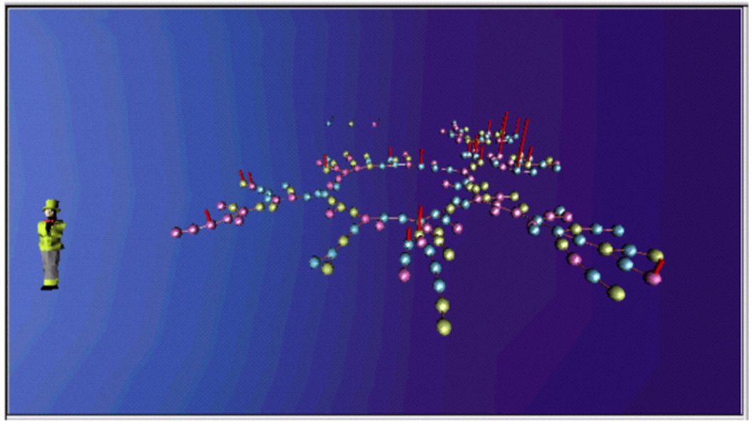
B: This is a screenshot from a multi-user virtual environment called StarWalker. Interestingly, I did not watch Star Wars until several years later. Visitors could gather around nodes that interested them, so their locations and proximities could themselves become meaningful. A concentration of visitors around a node might signal shared interest, while proximity among visitors could suggest overlapping attention or emerging opportunities for interaction. This type of environment adds a social dimension to the intellectual space: not only are knowledge objects spatially organized, but the presence, movement, and proximity of people within that space become meaningful as well.
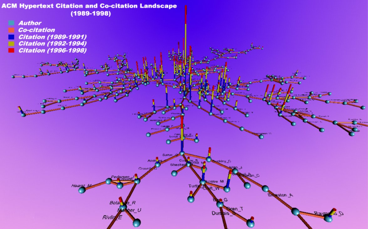
C: I hope the legend is clear enough to help you interpret the 3-dimensional VRML model. Nodes are clickable, allowing viewers to explore individual items in the intellectual space. The growth of citations is animated frame by frame, with each tick representing one year. As time advances, the changing citation structure becomes visible as an evolving spatial landscape. We don't have to leave Earth to fly through intellectual space and time.
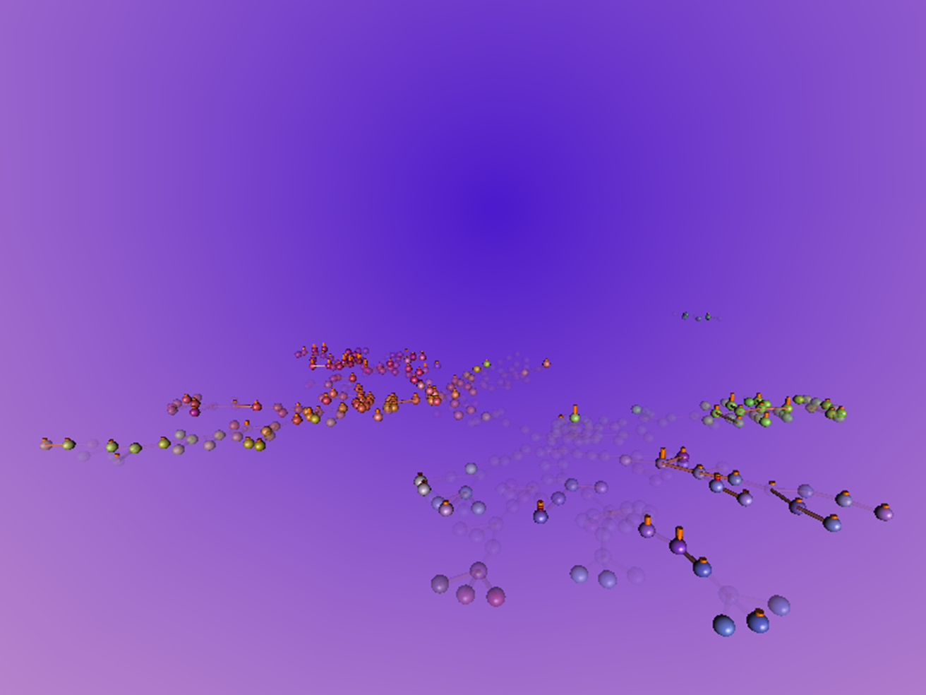
D: History can be replayed so that we can watch the formation of the intellectual structure again and again. The layout is precalculated using the overall network, and the animation then rewinds its development through time. Translucent nodes represent articles that had not yet been published at the particular time being shown. As the history unfolds, nodes and streams of research that initially appear in relatively separate regions gradually move into view as parts of what will eventually become a densely connected intellectual “downtown.”
What would it look like when several previously separate streams of research eventually merge?
What's Next
If there is one message to take away, it is that CiteSpace visualizations are not simply pictures of data; they form a visual language for exploring how knowledge is organized, how it evolves, and where it may be heading. Learning this language helps us move across levels of analysis, recognize patterns, connect the dots, and—just as importantly—ask better questions. The visual patterns are not conclusions by themselves, but they can guide where we direct our attention next.
Briefly Annotated References
Chen, C. (2004) Searching for intellectual turning points: Progressive knowledge domain visualization. PNAS, 101 (suppl_1), 5303-5310. DOI: 10.1073/pnas.0307513100
Progressive knowledge domain visualization, introduced in the 2004 PNAS paper (Chen, 2004), operationalizes a core methodology that subsequently became central to CiteSpace. A series of time-sliced snapshots of an evolving knowledge domain are synthesized into a holistic, panoramic view so that key structural and temporal characteristics associated with Kuhnian-style scientific revolutions can be recognized more easily. The method was applied to the literature of superstring research in physics, in which two major revolutions had been documented. Visually salient landmarks and potential turning points were identified and then cross-referenced with existing historical accounts of the two revolutions. Particularly insightful feedback came from Edward Witten, who kindly reviewed an earlier version of the visualization and offered his expert perspective on the field. Such feedback from domain experts is an integral part of a visual analytic study of a knowledge domain.
Chen, C. (2006) CiteSpace II: Detecting and visualizing emerging trends and transient patterns in scientific literature. Journal of the American Society for Information Science and Technology, 57(3), 359-377. DOI: 10.1002/asi.20317
It became clear soon after the 2004 PNAS study that even faithfully reconstructed visualizations and animations might not be sufficient to pinpoint the intellectual turning points that profoundly shaped the developmental trajectory of a knowledge domain. A razor-sharp visualization of critical turning points would be ideal. This realization motivated the introduction of computational indicators such as burst detection and betweenness centrality in CiteSpace II. These indicators were visually encoded so that potentially significant structural and temporal features could be recognized more easily.
This computationally enhanced visualization approach was applied in two case studies: mass extinction research (1981–2004) and terrorism research (1990–2003). The terrorism dataset has since been distributed with CiteSpace as a benchmark project. Both case studies were evaluated by domain experts whose own work was prominently represented in visualizations of their respective fields. The purpose was to verify whether the key turning points highlighted by CiteSpace were indeed characterized correctly. These evaluations were highly enlightening and inspiring, and further reinforced the importance of combining computational indicators, visual analysis, and domain expertise.
Chen, C., Ibekwe‐SanJuan, F., Hou, J. (2010) The structure and dynamics of cocitation clusters: A multiple‐perspective cocitation analysis. Journal of the American Society for information Science and Technology, 61(7), 1386-1409. DOI: 10.1002/asi.21309
The third major installment in the development of CiteSpace focused on how to make sense of clusters identified through a generic and consistent procedure. The field of information science was used as a testbed for this further enhanced visual analytic framework. Computationally generated cluster labels and summaries were evaluated against labels provided by domain experts, with the goal of assessing how well the automatically derived descriptions captured the intellectual meaning of the clusters.
Chen, C. (2012) Predictive effects of structural variation on citation counts. Journal of the American Society for Information Science and Technology, 63(3), 431-449. DOI: 10.1002/asi.21694
This paper introduced Structural Variation Theory and demonstrated its use across several case studies: complex network analysis (1996–2004), mass extinctions (1991–2010), terrorism (1996–2005), and applications of CiteSpace (2001–2010). A subsequent study applied the approach to Nobel Prize–winning papers, providing a further test of its ability to detect potentially transformative structural changes, and was published in PLOS ONE.
Chen, C., Hu, Z., Liu, S., Tseng, H. (2012) Emerging trends in regenerative medicine: a scientometric analysis in CiteSpace. Expert Opinion on Biological Therapy 12 (5), 593-608. DOI: 10.1517/14712598.2012.674507
The involvement of domain experts in a literature survey is invaluable. Pragmatically, however, we would like to develop tools that can reduce the degree of reliance on domain experts without compromising quality, because such expertise is a scarce and precious resource, especially in rapidly moving areas of research. More importantly, domain expertise is often highly specialized. It is unrealistic to expect any individual expert to cover the broad landscape of a knowledge domain with equally strong and applicable expertise throughout. This study of regenerative medicine deliberately selected a domain about which we knew very little, so that we could test how far we might go using the exploratory and explanatory computational approaches enabled by CiteSpace. This represented a significant step in the development of the methodology, as we began to turn our attention to the feasibility and generalizability of the approach beyond its comfortable home ground of computing and information science.
Chen, C., Leydesdorff, L. (2014) Patterns of Connections and Movements in Dual-Map Overlays: A New Method of Publication Portfolio Analysis. DOI: 10.1002/asi.22968
This paper introduced Dual-Map Overlays to reveal journal-to-journal citation paths.
Chen, C. (2017) Science Mapping: A Systematic Review of the Literature. Journal of Data and Information Science, 2(2), 1-40. DOI: 10.1515/jdis-2017-0006
The goal of this showcase study was to demonstrate how a new type of systematic review could be conducted with knowledge-domain visualization tools grounded in theories and principles of scientific change. The study employed a wide range of visualization and analytic techniques, including Dual-Map Overlays, Concept Trees, Citation Burst History, Cluster View, Timeline View, and SVA, showing how multiple complementary views can be brought together to examine the structure, evolution, and potentially transformative developments of a knowledge domain.
Chen, C., Song, M. (2019) Visualizing a Field of Research: A Methodology of Systematic Scientometric Reviews. PLoS One, 14(10), e0223994. DOI: 10.1371/journal.pone.0223994
The notion of global coverage is understandably appealing. We feel uneasy when we know that something potentially useful may have been left out. We discussed the tension between globalism and localism and emphasized the relativity of the seemingly comprehensive coverage offered by global models. No database, regardless of how large it may be, can provide truly global coverage in an absolute sense. As an alternative, we proposed a perspective that bridges these two extremes through cascading citation expansion, with the goal of obtaining the most representative view of a knowledge domain with the least amount of data. In essence, this is an optimization strategy: maximize representativeness rather than data volume, preserving precision where it matters most instead of blindly inflating recall by flooding the data pool with everything we can get hold of.
Chen, C. (2020) A Glimpse of the First Eight Months of the COVID-19 Literature on Microsoft Academic Graph: Themes, Citation Contexts, and Uncertainties. Frontiers in Research Metrics and Analytics, 5:607286. DOI: 10.3389/frma.2020.607286 citation contexts; uncertainties
This paper demonstrated how citation contexts may enrich our understanding of thematic patterns at a finer level of granularity. Concept tree visualizations are particularly suitable for this level of examination. The unit of analysis is a citation context, which provides an additional layer of representation of the underlying knowledge domain. The concept tree of a cluster labeled as pregnant women revealed vertical transmission as the primary concern in COVID-19.
2 comments

amazing <3

Thank you. I'm glad you enjoyed the blog.